
More than 60% of website traffic in Germany now comes from mobile devices — closer to 75% in e-commerce and 80% in younger consumer segments. Yet most German sites still convert mobile traffic at half the rate of desktop. The result: a business that thinks it’s optimized when in reality it’s only optimized for the shrinking minority of its visitors.
Mobile conversion optimization is not about scaling down the desktop site. It’s about rethinking the conversion flow for a device with smaller screens, slower networks, less patience, and entirely different ergonomics. This guide covers what works specifically in the German market in 2026 — Core Web Vitals on 4G, mobile checkout patterns, thumb-zone UX, German payment method coverage, and the specific A/B tests that close the mobile-desktop conversion gap.
Why is mobile conversion the highest-leverage CRO project in 2026?
The mobile-desktop conversion gap is the single largest pool of recoverable revenue most German sites have. Typical e-commerce sites convert desktop at 2.5–4% and mobile at 1.2–2%. If 70% of traffic is mobile, closing even half of that gap usually outperforms a year of desktop testing.
The gap exists for predictable reasons: slower load times on mobile networks, forms designed for keyboards rather than thumbs, checkout flows that assume a full keyboard, payment methods missing for mobile-preferred buyers, and CTAs placed where thumbs cannot easily reach. Each is fixable. None requires guessing.
If you haven’t yet audited your overall funnel, our CRO audit checklist covers the broader review, and our conversion rate benchmark Germany shows realistic mobile vs desktop targets by industry.
What are the German mobile-buyer expectations in 2026?
German mobile buyers expect: a page that loads in under 2.5 seconds on 4G, prices that include VAT visibly, payment options including PayPal, Klarna, and SEPA Lastschrift, German-language interface (not auto-translated English), and a clear cancellation/return path. Anything below this baseline gets bounced.
Specifically for B2C: the Federal Statistical Office data shows 88% of German online shoppers have abandoned a mobile purchase due to slow loading. 64% have abandoned due to a form being too long or hard to use on a phone. 41% have abandoned because their preferred payment method wasn’t available. These three friction points — speed, forms, and payments — account for the bulk of the mobile conversion gap.
For B2B audiences, mobile expectations are different but still significant. B2B buyers research on mobile, evaluate vendors during commutes, and then complete purchase on desktop. Mobile conversion for B2B sites is often a “save / share / book demo” action rather than a complete purchase. Optimize for the realistic mobile outcome, not a copy-paste of the desktop checkout.
How fast does a German mobile page need to load?
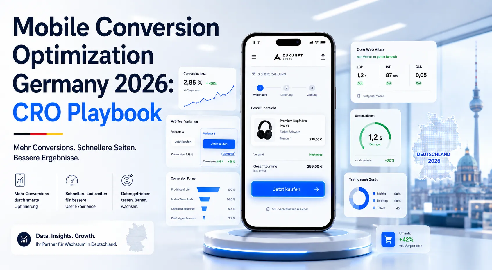
Google’s Core Web Vitals thresholds: Largest Contentful Paint (LCP) under 2.5 seconds, Interaction to Next Paint (INP) under 200ms, Cumulative Layout Shift (CLS) under 0.1. These are the minimum. For German mobile commerce, our internal client data shows conversion stays flat between 1.5–2.5s LCP, then drops sharply above 2.5s — losing roughly 7% conversion per additional second.
Concrete targets: LCP under 2.0s, INP under 150ms, CLS under 0.05, Time to First Byte (TTFB) under 600ms. Hitting these on real German 4G networks (not just lab tests in Chrome DevTools) is the difference between competing and not competing for mobile commerce.
Quick wins for German hosting: use a German or EU-edge CDN, enable HTTP/3, defer non-critical JavaScript, lazy-load images below the fold, eliminate render-blocking third-party scripts (chat widgets, A/B test tools loaded synchronously, analytics tags). Our Core Web Vitals SEO impact guide covers the technical mechanics.
What is the thumb-zone, and why does it matter for conversion?
The “thumb zone” is the area of a mobile screen reachable by the thumb when holding a phone with one hand. Steven Hoober’s research and subsequent studies show that 49% of smartphone users hold one-handed, 36% cradle with two hands but operate with thumb, and only 15% use two thumbs. For most users, only the bottom-center 60% of the screen is comfortable.
Conversion implication: critical CTAs should sit in the lower third of the screen, never the top right corner. Sticky bottom CTAs (“Jetzt kaufen”, “In den Warenkorb”) consistently outperform mid-page or top-right CTAs in mobile commerce tests. The header logo and hamburger menu can sit at the top because those are not where decisions happen.
Forms: top-of-form fields are hardest to reach with a thumb. Counter-intuitively, this is sometimes fine because the keyboard pushes the visible area down. But submit buttons must be in thumb range, and floating action buttons (FABs) for primary actions remain a strong pattern in mobile commerce.
How should mobile forms be designed for the German market?
Mobile forms are where most German checkouts hemorrhage conversions. Common mistakes: too many fields, fields that don’t trigger appropriate keyboards, no autocomplete, no inline validation, address fields not split correctly for the German format (Straße + Hausnummer, PLZ + Ort).
Specifically German address handling: split Straße/Hausnummer into one labeled field with both elements (“Straße und Hausnummer”) or two separate fields. PLZ field should accept exactly 5 digits with numeric keyboard. Ort field should autocomplete from PLZ via API (Deutsche Post and free alternatives like OpenPLZ exist). Land field should default to Deutschland and only show if shipping outside DE.
Phone numbers: pre-fill +49 country prefix, show numeric keypad, accept various formatting (spaces, dashes). Email: use type="email" to surface the @ key. Name fields: separate Vorname and Nachname (combined “Full Name” is an Anglo pattern that confuses German address validation).
Inline validation as the user moves between fields is essential. Don’t wait until submission to show errors. Don’t validate as they type within a field (annoying). The pattern: validate on blur, show check or X immediately, scroll error into view if user submits with errors.
Autofill: ensure all fields have proper autocomplete="given-name", autocomplete="postal-code" etc. attributes so iOS and Android autofill works. Half of mobile checkout abandonment can be eliminated by getting autocomplete to work properly.
What checkout patterns convert best on mobile in Germany?
Single-page checkouts win for German mobile commerce, with one critical exception: very long checkouts (B2B with PO numbers, custom delivery options, VAT validation) should split into 2–3 steps. The principle: minimize total taps and total scroll without forcing scary 15-field single screens.
Guest checkout must be available and at least as prominent as account creation. German consumers are wary of unnecessary account creation. The pattern that converts: “Weiter als Gast” button equal in visual weight to “Konto erstellen” button. Capture email first, mention “Sie können nach dem Kauf optional ein Konto erstellen”, then proceed.
Address autocomplete via Google Places API (with DSGVO-compliant configuration) reduces address entry to 3–5 taps. The privacy consideration: ensure your cookie banner discloses Google Places usage, and consider European-hosted alternatives if your audience is privacy-sensitive.
Sticky order summary on mobile: shows current total without requiring scroll. Especially important if you have shipping costs, discount codes, or VAT toggles that change the total. Buyers want to see what they’ll pay at all times.
Which payment methods are mandatory for German mobile?
The minimum German payment method coverage in 2026:
- PayPal — required, used by ~50% of German consumers, especially trusted on mobile
- Kreditkarte — Visa and Mastercard, including 3D Secure 2 with mobile-friendly OTP flow
- Klarna — including Pay in 30 days, Pay in 3, and standard buy now pay later. ~30% of German online buyers prefer Klarna
- SEPA Lastschrift — direct debit, important for higher-trust merchants and subscriptions
- Apple Pay / Google Pay — fastest-growing on mobile, single-tap checkout, must support
- Sofortüberweisung / Giropay — declining but still meaningful for older demographics
- Rechnung (invoice) — significant in B2C apparel and electronics; requires credit-check integration
For B2B specifically, also offer: bank transfer (Rechnung mit Überweisung), SEPA Firmenlastschrift, and increasingly Stripe Billing with multi-payment-method support.
Mobile payment UX: present payment methods as visual buttons with logos, not a dropdown menu. Save preferred payment method after first use. Pre-fill saved cards. Apple Pay and Google Pay should appear as their own large buttons because they enable 2-tap checkout that conventional cards cannot match.
For Shopify and WooCommerce payment configuration, see our Shopify SEPA Lastschrift guide, Shopify Klarna Germany guide, and Stripe SEPA payment integration guide.
How do mobile-specific trust signals work?
Trust signals on mobile must be condensed. Desktop pages can show a full trust bar with Trusted Shops, ISO badges, customer logos. Mobile real estate is too scarce for all of it. Pick 2–3 that matter most and place them strategically.
Near the mobile CTA: one badge maximum. Trusted Shops for German B2C e-commerce is the strongest single signal. For B2B SaaS, ISO 27001 or DSGVO-Konformität. For services, a star rating from Google or ProvenExpert.
In the footer: condensed trust strip with Impressum, AGB, Widerrufsbelehrung, Datenschutz. These must be visible — DSGVO and German law require them on every page, mobile included. Use small but legible text and tap-friendly link spacing.
In the checkout: SSL padlock visual reference, “Sichere Zahlung mit 256-Bit-Verschlüsselung”, and Trusted Shops Käuferschutz callout if applicable. The fear at checkout is that something goes wrong with payment. Visible security signals reduce that fear.
For broader trust signal strategy, see our trust signals conversion guide.
How should mobile navigation be structured?
Hamburger menu is acceptable but not optimal. Studies repeatedly show that hamburger menus reduce engagement compared to visible navigation. The optimal pattern for German mobile commerce: 4–5 primary categories visible in a horizontal scroll strip below the header, plus a hamburger for secondary navigation.
Search must be prominent on mobile. The search icon should be in the header at all times. Mobile commerce traffic that uses internal search converts at 2–3x the rate of browsing traffic. Make search prominent and ensure it works (autocomplete suggestions, typo tolerance, German-language stemming).
Breadcrumbs: useful on desktop, controversial on mobile. They take vertical space. For deep category hierarchies, a single “← Zurück zu Kategorie” link at the top works better than full breadcrumbs.
Tabbed product pages: avoid on mobile. Linear scrolling beats tabs because buyers can’t easily see which tabs they’ve explored. Stack all content vertically with clear H2 section headings.
What mobile pop-ups are acceptable in 2026?
Google’s mobile interstitial penalty (since 2017) penalizes intrusive pop-ups that block content on entry. Acceptable patterns: cookie consent (legally required), age verification (legally required), entry confirmations limited to small banners.
Newsletter pop-ups on mobile: only after meaningful engagement (scroll 50%, time on page 30s, or exit intent). Newsletter pop-ups on mobile entry destroy both SEO and CRO. Bottom-anchored slim banners (“Hol dir 10% Rabatt”) outperform full-screen overlays.
Exit-intent on mobile doesn’t work the way it does on desktop (no mouse leaving the viewport). Mobile “exit intent” is approximated through scroll-up speed or back-button detection. Use sparingly and only on cart pages or pricing pages where you have legitimate risk-reversal to offer.
For e-commerce specifically, see our cart abandonment recovery CRO guide and checkout optimization guide for the full flow.
How do you handle mobile product pages?
E-commerce mobile product pages need: high-quality product images with pinch-to-zoom, swipeable gallery, sticky add-to-cart button, condensed product description with expandable details, prominent reviews, and clear shipping/returns information.
Image gallery: vertical-swipe carousel on mobile (not horizontal — horizontal conflicts with native back-swipe gestures on iOS). 4–6 product images optimized to under 100KB each via WebP or AVIF. Lazy-load images below the fold. Pre-load the first 2 images for fast LCP.
Description: first 2–3 sentences visible by default with “Mehr lesen” expand. Full description, specifications, and care instructions in collapsible sections. Buyers scan; they don’t read product descriptions exhaustively unless they’re already convinced.
Variant selection (size, color): visual swatches not dropdowns. Show “Nicht verfügbar” or grey out unavailable combinations rather than hiding. Sticky variant selector that scrolls with the user so they can change selection without scrolling back.
Add-to-cart confirmation: slide-up panel with “Im Warenkorb” + cross-sell of 2–3 related products + “Weiter einkaufen” and “Zur Kasse” buttons. Replaces the old pattern of redirecting to cart page.
What does mobile speed optimization look like in 2026?
Specific techniques that move Core Web Vitals on real German mobile:
- Image optimization: WebP or AVIF, responsive srcset, lazy loading (
loading="lazy"), aspect-ratio CSS to prevent CLS - Font loading:
font-display: swap, subset fonts to Latin character set, preload critical fonts - JavaScript: defer non-critical scripts, code-split by route, eliminate unused libraries, lazy-load chat widgets and A/B test tools
- CSS: critical CSS inlined for above-the-fold, rest loaded async
- Third-party scripts: audit ruthlessly. Each tag adds 50–300ms. Consent management platforms, analytics, A/B testing, chat, social pixels, retargeting — kill or defer everything not essential
- Server: PHP 8.3+, OPcache enabled, page caching (Redis or Varnish), HTTP/3, Brotli compression
Run PageSpeed Insights on real German 4G (“Mobile” tab, throttled). The score in DevTools on a fast desktop connection is meaningless. The score on slow 4G German mobile is what matters for conversion.
What A/B tests should you run on mobile first?
In order of historical impact in our agency work:
- Sticky bottom CTA on key pages (product, pricing, contact). Almost always wins on mobile.
- Shorter checkout form (remove non-essential fields, defer to post-purchase).
- Apple Pay / Google Pay as primary buttons vs hidden in payment methods list.
- Guest checkout prominence vs forced account creation.
- Sticky order summary with always-visible total in checkout.
- Vertical product image swipe vs horizontal swipe.
- Search bar visibility in mobile header vs hidden behind icon.
- Payment method order (Apple Pay, Google Pay, PayPal, Klarna first vs cards first).
Run mobile tests separately from desktop. Behavior differs enough that combining them obscures the signal. See our A/B testing tools comparison for mobile-friendly testing platforms.
How do you measure mobile conversion separately from desktop?
In GA4, segment all your funnel reports by device category. Track these mobile-specific metrics:
- Mobile bounce rate by landing page — anything above 60% needs investigation
- Mobile page speed by template (product, category, checkout, blog) via Core Web Vitals report
- Mobile add-to-cart rate vs desktop add-to-cart rate
- Mobile checkout abandonment by step — pinpoints which step is failing
- Mobile payment method usage — reveals when buyers are picking suboptimal methods because preferred is missing
- Mobile vs desktop conversion rate gap — the master metric for this optimization area
Our GA4 conversion tracking guide covers the segment setup, and our funnel analysis Germany guide explains step-by-step abandonment tracking.
What does mobile CRO cost in Germany?
A focused mobile CRO project — full mobile audit, redesign of 3–5 critical templates, checkout rebuild, payment method expansion, performance optimization — typically runs €15,000–€35,000 over 8–12 weeks. The payback period for German e-commerce sites doing €1M+/year is usually under 4 months.
Ongoing mobile optimization (A/B testing, payment method tuning, speed monitoring) runs €2,500–€6,000/month. Some of this work overlaps with general CRO retainers — see our CRO cost Germany guide for total budget context.
Frequently asked questions about mobile conversion optimization
Responsive design only in 2026. Separate m. subdomains create SEO + content duplication problems.
Increasingly important. iPhone users expect it. Native Shopify, Stripe/Mollie for WooCommerce.
Depends on industry. E-commerce: 1.5–2.5%. B2B SaaS: 0.5–1.2%. Services: 3–6% high-intent.
Almost never as primary investment. Apps cost 5–10x more. Most Mittelstand businesses are better served by mobile web.
Skeptical. Push: explicit opt-in. SMS: regulated, double opt-in required. Email remains dominant.
Significant for B2B + Mittelstand customer service. DSGVO-compliant WhatsApp Business drives 2–3x efficiency.
Sometimes yes. Complex pricing: simpler mobile display. Test stacked vertical vs side-by-side.
For retail and content sites: yes. Offline functionality + push + home-screen install without app store overhead.
Ready to close your mobile-desktop conversion gap?
If your mobile conversion is meaningfully below your desktop conversion, there is recoverable revenue sitting in plain sight. The work is concrete: measure, prioritize, fix, test, repeat. The compounding effect on a business where 70% of traffic is mobile is hard to overstate.
Book a meeting for a free mobile CRO audit where we’ll review your Core Web Vitals, mobile checkout flow, payment method coverage, and conversion analytics to identify the top 5 fixes that will move your mobile conversion rate fastest. Or browse our conversion rate optimization services and contact us to discuss a full mobile CRO engagement.