
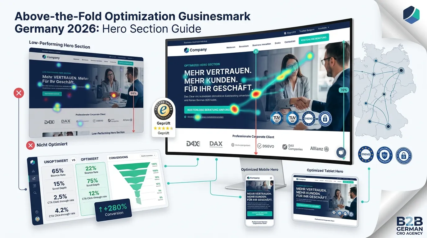
The above-the-fold area is the first 1–2 seconds of your visitor’s experience. Get it right, they engage. Get it wrong, they bounce. For German websites in 2026, hero section optimization is one of the highest-leverage CRO investments — affects every visitor, every campaign, every page.
This guide walks through what above-the-fold optimization for German CRO actually requires in 2026: hero section structure, value proposition formulation, mobile vs desktop differences, common mistakes, and A/B testing patterns.
For broader CRO see our CRO services Germany guide.
What’s above-the-fold?
The portion of the page visible without scrolling.
Variable by device
- Desktop: ~800×600 px to 1920×1080 px
- Tablet: ~1024×768 px
- Mobile: ~375×667 px to 414×896 px
Why it matters
- Users decide in 2–5 seconds if to stay
- Bounce rate strongly correlated with above-fold quality
- All later content depends on user staying past first impression
What elements belong above the fold?
For most German websites:
Primary elements (essential)
- Clear headline (value proposition)
- Subheading or supporting text
- Primary CTA button
- Hero image or video (supporting message)
Important elements (often)
- Trust signal (customer logos, reviews, awards)
- Brief social proof
- Visible navigation
Avoid
- Multiple competing CTAs
- Too much text
- Generic stock photos
- Anything that doesn’t serve conversion
What makes a strong headline?
Five characteristics:
Specific outcome promised
“Reduce shipping costs 30%” beats “Better shipping.”
For specific audience
“Built for German Mittelstand e-commerce” beats “For everyone.”
Concrete and believable
Numbers + specifics outperform abstractions.
Brand voice consistent
Match overall site voice (Sie vs du, formal vs casual).
Differentiated
What only you can claim. Avoid generic claims competitors say.
What’s the value proposition structure?
A 3-part formula:
“We help [X] do [Y] by [Z]”
Example: “Wir helfen deutschen Mittelstandsunternehmen, ihre Conversion-Rate zu verdoppeln, durch datengetriebene A/B-Tests.”
Or 4-line headline + subhead
- Headline: Specific outcome
- Subheading: Who it’s for + how
- Brief supporting line: Differentiator or social proof
- CTA: Clear next step
For headline depth see our landing page optimization guide.
What hero image / video should you use?
Five image strategies:
Real product / service in use
If you have product: show it. Hero device + screen = standard for SaaS.
Customer outcome visualization
Before/after, results displayed.
Custom illustration
Brand-specific style. Outperforms stock photos.
Authentic team / customer photos
Real people, not stock models.
Hero video (autoplay muted)
Short loop (15-30 seconds). Demo or product overview.
Avoid
- Generic stock photos
- Photos that look US-American on German sites
- Overly produced corporate imagery
What’s the mobile vs desktop hero difference?
Major differences:
Mobile above-fold
- Much less real estate
- Hero image often takes most of viewport
- Trust signals often pushed below fold
- CTA can dominate
- Touch interactions critical
Desktop above-fold
- More content space
- Trust signals fit alongside hero
- Multiple visual elements possible
- Mouse hover patterns matter
Implication
Don’t design desktop-first then squeeze for mobile. Design mobile-first ensuring critical elements fit.
What about hero performance?
Above-the-fold performance is critical:
LCP element typically above fold
Hero image, hero text, or hero video.n
Optimize hero image
WebP format, proper sizing, lazy load below fold.
Defer non-critical JS
Don’t block hero rendering with marketing scripts.
Critical CSS inline
Above-fold CSS in <head>. Below-fold deferred.
For broader speed see our Shopify speed optimization guide (principles apply across platforms).
What German-specific above-fold considerations?
Four factors:
Cookie banner interaction
Banner appears above fold initially. Then dismisses + reveals hero. Account for the disruption.
Trust signal expectation
German users scan for credibility immediately. Visible trust signals above fold improve engagement.
Information density
German users tolerate more content above fold than US users. Don’t oversimplify.
Sie-form professional default
For B2B: Sie-form in hero. Du only for explicitly modern consumer brands.
For German market context see our CRO services Germany guide.
What CTA design wins above the fold?
Five characteristics:
Specific action
“Beratungsgespräch anfragen” beats “Submit”
Visual prominence
Contrast color, clear button design. Stands out.
Single primary CTA
Don’t compete with multiple equally-prominent CTAs.
Above-fold + below-fold
Visible at top + repeated through page.
Reassurance
“Free + no credit card” or “Reply within 24 hours.”
For CTA depth see our CTA button optimization Germany guide (forthcoming, #155).
What A/B tests work for above the fold?
Five high-impact tests:
Headline variations
3–5 different value propositions. Often biggest impact.
Hero image variations
Different image types. Stock vs custom. Product vs lifestyle.
CTA copy
Different action verbs. Outcome-focused vs feature-focused.
CTA placement
Center vs right. Above text vs below.
Trust signal placement
Logos above CTA vs below. Or testimonial directly above.
For broader A/B testing see our A/B testing Germany guide.
What are common above-the-fold mistakes?
Five patterns:
Generic stock photos
US-American-looking models on German B2B site. Doesn’t fit.
Multiple competing CTAs
“Sign up + Demo + Contact + Learn more” all above fold. User paralysis.
Vague headline
“The best solution for your business.” Says nothing specific.
Trust signals only below fold
Above-fold ignored. Visitors don’t see credibility quickly.
Slow hero load
Hero image 2MB+. LCP >3s. Visitors leave before seeing.
How do you measure above-the-fold performance?
Five KPIs:
Bounce rate
Critical metric. Aggregate site bounce + landing page-specific.
Scroll depth
% of users scrolling below fold. Below 60% = above-fold issue
Time-on-page
Short time = users not engaging.
Hero CTA click-through
Direct measure of CTA effectiveness.
Heatmap analysis
What users look at. Click. Hover.
For broader analytics see our GA4 conversion tracking guide.
What’s the typical above-the-fold optimization process?
A 6-step approach:
Step 1: Audit current state
Heatmap analysis. Scroll depth. Bounce rate.
Step 2: User research
Why are users not engaging? Survey, interviews.
Step 3: Hypothesize improvements
Headline clarity, image quality, CTA prominence.
Step 4: A/B test
Methodologically test 1 element at a time.
Step 5: Iterate
Implement winners. Move to next element.
Step 6: Measure aggregate impact
Bounce, scroll depth, conversion. Compare pre/post.
For user research see our user research for CRO guide.
What hero section examples work in German market?
Three pattern examples:
B2B SaaS example
Headline: “Verdoppeln Sie Ihre Conversion-Rate in 90 Tagen.” Subheading: “Datengetriebene CRO für deutsche Mittelstandsunternehmen — ohne langfristige Verträge.” CTA: “Kostenlose Analyse anfragen” Trust: “127+ deutsche Kunden | 4.8/5 Sterne (Trusted Shops)”
B2C product example
Headline: “Frisches Bio-Brot aus Berlin – wöchentlich nach Hause geliefert.” Subheading: “Handwerklich gebacken. Bio-zertifiziert. Innerhalb von 12 Stunden bei Ihnen.” CTA: “Probierpaket bestellen” Trust: Star rating + “1.000+ Kunden in Berlin”
Service business example
Headline: “Steuerberatung für IT-Freelancer — alles digital, alles transparent.” Subheading: “Ab €99/Monat. Keine Mindestlaufzeit. Innerhalb 48h-Antwort garantiert.” CTA: “Kostenloses Erstgespräch buchen” Trust: “Über 800 IT-Freelancer betreut | Mitglied im Steuerberaterverband”
Frequently asked questions about above-the-fold optimization
Page area visible without scrolling. Varies by device. Critical for first impression.
Headline, subheading, CTA, hero image, brief trust signal. Avoid competing CTAs + clutter.
50–80 characters typical. Specific outcome promised + audience identification.
Yes if it adds clarity. Short autoplay-muted loops work. Avoid required-click videos.
Design mobile-first. Critical elements must fit small viewport. Desktop adapts naturally.
Banner appears first, then dismisses to reveal hero. Account for disruption. Optimize banner UX.
40–70% bounce typical. Above 70% = significant above-fold issue. Below 40% excellent.
Test elements singly: headline, hero image, CTA copy, CTA placement, trust signal positioning.
Need help with above-the-fold?
If you’re scoping hero section optimization for your German site and want a 30-minute scoping conversation about structure + A/B testing strategy, book a meeting or send details via our contact page.