
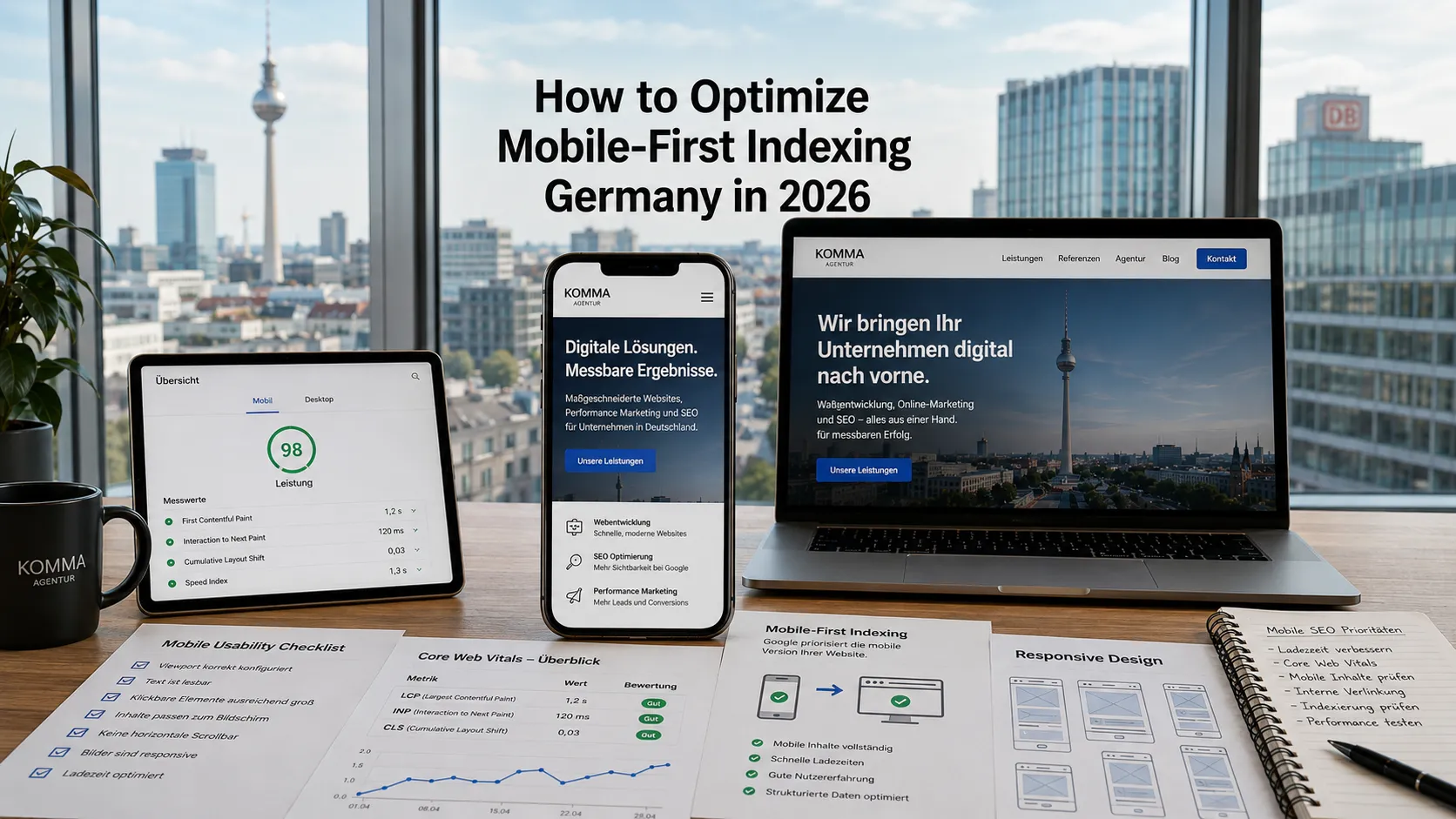
Mobile-first indexing Germany has been Google’s default since 2019, meaning Googlebot crawls and indexes your site using its mobile crawler primarily. For German websites in 2026, mobile-first isn’t optional; it’s the foundation. Sites that still treat mobile as “the secondary experience” rank visibly worse than mobile-optimized competitors.
This guide walks through what mobile-first indexing Germany actually requires in 2026: how it works, optimization checklist, mobile UX patterns, Core Web Vitals on mobile, and common gaps that hurt mobile rankings.
What is mobile-first indexing?
Google primarily uses the mobile version of your content for indexing + ranking. The desktop version is secondary.
Practical implications
- Mobile content > desktop content for ranking
- Mobile UX directly affects rankings
- Mobile Core Web Vitals critical
- If your mobile site has less content than desktop, that less is what Google sees
Google’s communication
Mobile-first indexing rolled out 2019–2022. By 2024, essentially all sites indexed mobile-first.
What does mobile-first indexing require from your site?
Eight requirements:
1. Mobile site has same content as desktop
Don’t hide important content on mobile. Same words, same value.
2. Mobile site has same metadata
Title tags, meta descriptions, headers match desktop.
3. Mobile site has same structured data
Schema markup present on mobile (not just desktop).
4. Mobile-friendly UX
Responsive design, readable font sizes, touch targets, no horizontal scroll.
5. Fast mobile page speed
Mobile-specific Core Web Vitals. Mobile bandwidth assumptions.
6. Mobile-accessible images
Image sizes appropriate for mobile screens. Alt text present.
7. Mobile-functional internal links
All internal links work on mobile (no hover-only navigation).
8. Mobile-friendly forms
Touch-friendly inputs, appropriate keyboard triggers (numeric, email).
What are mobile Core Web Vitals targets?
Mobile thresholds are tougher than desktop because mobile devices are slower:
LCP (Largest Contentful Paint)
- Target: under 2.5s
- Stretch: under 1.8s
INP (Interaction to Next Paint, replaced FID in 2024)
- Target: under 200ms
- Stretch: under 100ms
CLS (Cumulative Layout Shift)
- Target: under 0.1
- Stretch: under 0.05
If your mobile Lighthouse Performance score is below 75, you have meaningful headroom.
For broader Core Web Vitals see our Shopify speed optimization guide — same principles apply across platforms.
What’s the mobile-first checklist?
12 essentials:
1. Responsive design
Single codebase, adapts via CSS media queries. No separate “m.example.com” mobile subdomain (legacy approach).
2. Viewport meta tag
<meta name="viewport" content="width=device-width, initial-scale=1">3. Readable font sizes
Body text 16px minimum. Headings appropriately larger.
4. Touch target sizes
Buttons + links 44x44px minimum touch area.
5. No horizontal scroll
Content fits viewport width.
6. Image responsive
srcset + sizes attributes. WebP format.
7. Mobile-optimized navigation
Hamburger menu or accessible mobile nav.
8. Forms designed for mobile
Large inputs, appropriate keyboard types, autocomplete attributes.
9. Fast page speed on 4G
Test on Slow 4G in Chrome DevTools. Should still feel acceptable.
10. Cookie banner mobile-friendly
Doesn’t cover content. Easy to dismiss.
11. Click-to-call phone numbers
tel: links for phone numbers.
12. Mobile-friendly CTAs
Prominent, easy to tap, no friction.
How do you test mobile-friendliness?
Google Mobile-Friendly Test (free)
Tests single URL. Quick pass/fail.
PageSpeed Insights mobile tab
Mobile-specific Core Web Vitals + suggestions.
Lighthouse mobile audit
In Chrome DevTools. Comprehensive mobile audit.
Real device testing
Test on actual phones (iPhone, Android). Emulators miss real-world issues.
Search Console Mobile Usability report
Site-wide mobile issues. Errors flagged automatically.
What are common mobile-first SEO gaps?
Five patterns on German websites:
Content hidden behind accordions
Tabs and accordions on mobile that hide important content. Google may not crawl tab content.
Different desktop vs mobile content
Desktop has more product details, mobile shows abbreviated. Mobile is what Google indexes.
Slow mobile due to apps + scripts
Especially Shopify with too many apps. See our Shopify speed optimization guide.
Cookie banner blocking content
Cookie banner covers entire mobile viewport. Hurts UX + CLS.
Click-to-call not implemented
Phone numbers as plain text. Mobile users can’t tap to call.
How does mobile-first interact with German market specifics?
Three considerations:
Bandwidth assumptions
German mobile users have decent 4G/5G but vary by region. Optimize for slower connections too.
Mobile shopping behavior
German mobile commerce growing. Mobile checkout UX critical.
Mobile cookie banner compliance
TTDSG cookie requirements mean cookie banner appears. Optimize banner mobile UX carefully.
What about mobile-only websites?
Some German businesses build mobile-only sites or apps. SEO implications:
Mobile-only website
Still indexed, but make sure desktop users get a usable experience (even if basic).
Native app
Not indexed via traditional SEO. Use App Indexing / Universal Links / App Store Optimization.
PWA (Progressive Web App)
Indexed like a normal website but installable. Mobile-first by default. See our PWA development Germany guide.
What about Accelerated Mobile Pages (AMP)?
AMP is largely deprecated in 2026:
- Google removed AMP requirement from Top Stories carousel (2021)
- Most publishers have migrated away
- Modern Core Web Vitals achievable without AMP
Don’t start with AMP in 2026
Plain responsive site with good Core Web Vitals matches or beats AMP performance + flexibility.
If you have legacy AMP
Migration to non-AMP responsive site is fine. Set up redirects properly.
What’s the right mobile testing workflow?
Five-step process:
Step 1: Lighthouse mobile audit
Run Lighthouse in Chrome DevTools (mobile profile). Establish baseline.
Step 2: Search Console Mobile Usability
Check site-wide issues. Fix critical errors first.
Step 3: Real device testing
Test on iPhone + Android. Different OS = different behaviors.
Step 4: Network throttling test
Chrome DevTools → Network → Slow 4G. Verify site still works.
Step 5: Quarterly re-test
Mobile UX issues creep in over time. Re-test quarterly.
Frequently asked questions
Google uses the mobile version of your content as the primary index.
No; use responsive design with a single codebase.
LCP < 2.5s, INP < 200ms, CLS < 0.1.
Body 16px minimum.
No; AMP is mostly deprecated in 2026.
Mobile-Friendly Test, PageSpeed Insights, Lighthouse, real device.
Optimize UX; don’t cover viewport; control CLS impact.
Yes; Google indexes mobile-first regardless of audience.
Need help with mobile SEO?
If you’re scoping mobile SEO for your German website and want a 30-minute scoping conversation about audit + priority fixes, book a meeting or send details via our contact page.