

Do you use your phone to access websites? The vast majority of people do. In 2026, mobile devices account for 59.16% of all global website traffic, with tablets adding another 5%. That means nearly two-thirds of your potential customers are viewing your website on a mobile device right now.
If your website isn’t optimized for mobile, you’re not just losing visitors—you’re losing revenue, search rankings, and competitive advantage. Studies show that 53% of mobile users abandon websites that take longer than 3 seconds to load, and 57% won’t recommend a business with a poorly designed mobile site.
The importance of mobile-friendly websites extends far beyond user experience. Since 2019, Google has used mobile-first indexing, meaning the search engine predominantly uses the mobile version of your website for ranking and indexing. In other words, if your mobile site isn’t up to standard, your entire online presence suffers.
This comprehensive guide covers everything you need to know about mobile-friendly websites in 2026: from responsive web design and mobile-first indexing to Core Web Vitals, Progressive Web Apps, mobile accessibility, and advanced optimization strategies.
Why Mobile-Friendly Websites Are Critical in 2026
Mobile-First Indexing: Google’s Priority
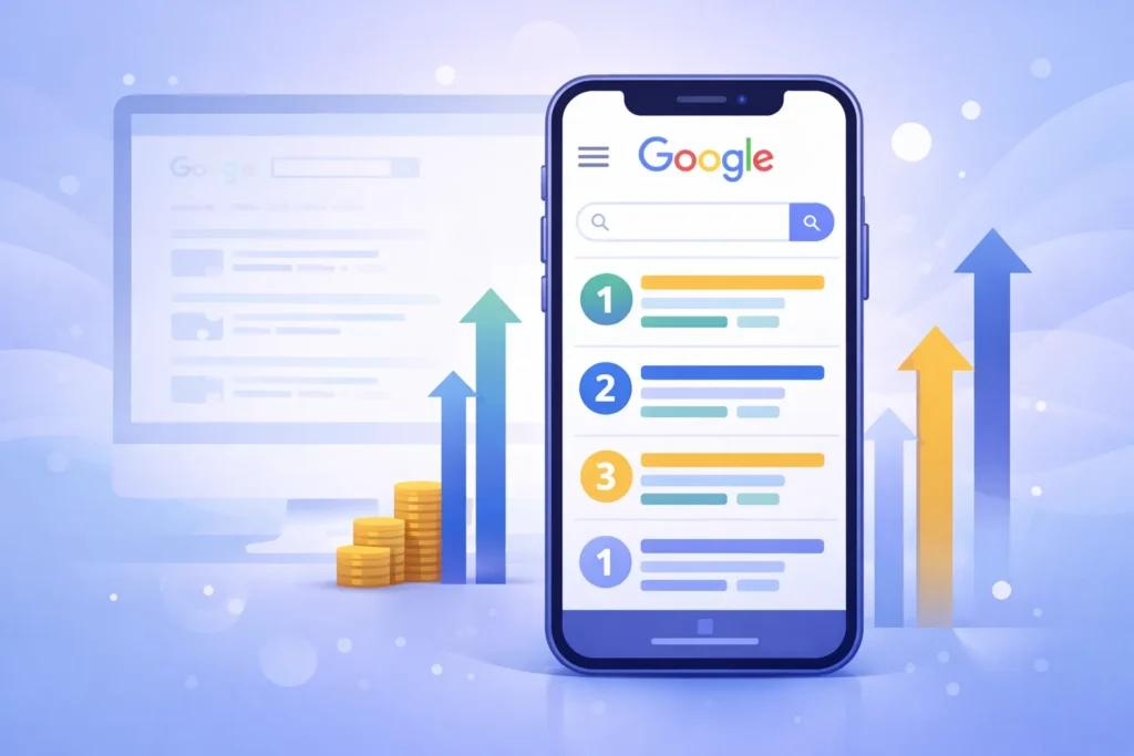
In March 2021, Google completed its transition to mobile-first indexing for all websites. This fundamental shift means that Google predominantly uses the mobile version of your content for indexing and ranking purposes, even for desktop search results.
What this means for your business:
- Google’s crawlers now use the smartphone user agent to evaluate your site
- The mobile version of your site determines your search rankings
- If your mobile site lacks content or features present on the desktop, those elements may not be indexed
- Mobile page speed directly impacts your search visibility
- Mobile usability issues can result in ranking penalties
Mobile-first indexing isn’t just a technical consideration—it’s a business imperative. Websites that fail to prioritize mobile optimization are effectively invisible to the majority of searchers.
Mobile User Behavior and Search Intent
Mobile users behave differently from desktop users, and understanding these differences is crucial for mobile optimization:
Search Query Patterns:
- Mobile searches are typically shorter and more conversational
- 27% of the global online population uses voice search on mobile
- “Near me” searches have grown by over 250% in recent years
- Mobile users have higher immediate action intent (calls, directions, purchases)
Mobile User Expectations:
- Instant loading (under 3 seconds)
- One-thumb navigation capability
- Minimal typing requirements
- Click-to-call functionality
- Streamlined checkout processes
Local Search Dominance:
- 76% of people who search for something nearby on their smartphone visit a business within a day
- 28% of local mobile searches result in a purchase
- Mobile searches like “where to buy,” “near me,” and “open now” continue to grow exponentially
The Business Impact of Mobile Optimization
The statistics paint a clear picture:
- Mobile commerce now accounts for over 72% of all e-commerce sales
- Companies with mobile-optimized websites see average conversion rate increases of 160%
- 88% of consumers who search for local businesses on mobile visit or call within 24 hours
- Websites that pass Core Web Vitals thresholds see up to 70% longer user sessions
- Mobile-friendly sites experience lower bounce rates (averaging 40% vs 60% for non-optimized sites)
The bottom line: mobile optimization directly impacts your revenue, customer acquisition, and competitive positioning.
Understanding Mobile-Friendly Approaches

Responsive Web Design vs. Mobile-First Design
While often used interchangeably, responsive design and mobile-first design represent different development philosophies:
Responsive Web Design:
- Starts with desktop design and adapts down to mobile
- Uses flexible grids, fluid images, and CSS media queries
- Single codebase serves all devices
- Adjusts layout based on screen size
- Best for existing websites being retrofitted for mobile
Mobile-First Design:
- Begins with mobile interface design, then scales up to desktop
- Prioritizes core functionality and content from the start
- Progressive enhancement adds features for larger screens
- Results in cleaner, faster-loading websites
- Ideal for new website projects in 2026
Which approach should you use?
For new projects, mobile-first design is the recommended approach. It forces you to prioritize essential content and functionality, resulting in better performance and user experience across all devices. For existing websites, implementing responsive design principles provides the fastest path to mobile optimization.
Progressive Web Apps (PWAs): The Next Evolution
Progressive Web Apps represent the convergence of web and native app capabilities, offering mobile-friendly websites with app-like experiences.
Key PWA Features:
- Offline Functionality – Service workers enable content access without an internet connection
- Installable – Users can add PWAs to their home screen without app store downloads
- Push Notifications – Re-engage users with timely updates
- Fast Loading – App shell architecture ensures instant loading
- Native-Like Experience – Full-screen mode, smooth animations, gesture controls
PWA Benefits for Businesses:
- 60% lower development costs compared to native apps
- 50% shorter development time
- No app store approval required
- Automatic updates without user action
- Cross-platform compatibility with a single codebase
- SEO benefits, unlike native apps
Real-World PWA Success Stories:
- Twitter Lite reduced data usage by 70% and increased pages per session by 65%
- Pinterest saw a 60% increase in core engagements and 44% increase in ad revenue
- Starbucks PWA is 99.84% smaller than their iOS app, doubling daily active users
If your business requires app-like functionality, consider PWA development alongside your mobile-friendly website strategy.
Core Web Vitals: The Performance Metrics That Matter
In 2021, Google introduced Core Web Vitals as official ranking factors. In 2026, these metrics remain critical for both mobile SEO and user experience.
Understanding the Three Core Web Vitals
1. Largest Contentful Paint (LCP) – Loading Performance
LCP measures how long it takes for the largest visible content element to render on screen.
- Good: 2.5 seconds or less
- Needs Improvement: 2.5-4.0 seconds
- Poor: Over 4.0 seconds
Mobile optimization for LCP:
- Optimize and compress images (use WebP or AVIF formats)
- Implement lazy loading for below-the-fold content
- Minimize CSS and JavaScript blocking time
- Use a Content Delivery Network (CDN)
- Upgrade hosting for faster server response times
- Preload critical resources
2. Interaction to Next Paint (INP) – Responsiveness
INP replaced First Input Delay (FID) in March 2024, measuring the time between user interactions and the browser’s response throughout the entire page visit.
- Good: 200 milliseconds or less
- Needs Improvement: 200-500 milliseconds
- Poor: Over 500 milliseconds
Mobile optimization for INP:
- Minimize main thread work
- Break up long JavaScript tasks
- Optimize event handlers
- Reduce render-blocking resources
- Use web workers for heavy computations
- Implement code splitting
3. Cumulative Layout Shift (CLS) – Visual Stability
CLS measures unexpected layout shifts during page loading—especially problematic on mobile devices.
- Good: 0.1 or less
- Needs Improvement: 0.1-0.25
- Poor: Over 0.25
Mobile optimization for CLS:
- Always specify image and video dimensions
- Avoid inserting content above existing content
- Use transform animations instead of properties that trigger layout changes
- Reserve space for ad slots and embeds
- Ensure web fonts don’t cause FOIT (Flash of Invisible Text)
Measuring and Monitoring Core Web Vitals
Essential Testing Tools:
- Google Search Console – Track real-user Core Web Vitals data for all your pages
- PageSpeed Insights – Analyze individual pages with both lab and field data
- Lighthouse – Comprehensive audits built into Chrome DevTools
- Chrome User Experience Report (CrUX) – Real-world performance data from Chrome users
- Web Vitals Chrome Extension – Real-time performance metrics while browsing
Best Practices:
- Check Core Web Vitals monthly at a minimum
- Test on actual mobile devices, not just emulators
- Monitor both desktop and mobile performance separately
- Track performance trends over time
- Set up automated monitoring alerts
Meeting Core Web Vitals thresholds isn’t just about Search Engine Optimization—it directly correlates with business metrics like conversion rates, bounce rates, and user engagement.
Mobile-First Indexing and Technical Mobile SEO
Ensuring Mobile-Desktop Parity
One of the most critical aspects of mobile-first indexing is content parity between mobile and desktop versions.
Critical elements that must match:
- Primary content – Text, images, and videos should be identical
- Structured data – Schema markup must be present on both versions
- Metadata – Titles, descriptions, and canonical tags
- Internal linking – All important links must appear on mobile
- Alt text – Image alternative text should be complete
- Headings – H1-H6 structure should match
Common mobile parity mistakes:
- Hiding content in mobile accordions that Google can’t crawl
- Using different URLs for mobile and desktop without proper annotations
- Omitting structured data from mobile pages
- Lazy loading images without proper implementation
- Removing navigation links on mobile
Mobile-Specific Technical SEO Checklist
Mobile XML Sitemaps:
- Create a mobile-specific sitemap if using separate mobile URLs
- Submit the mobile sitemap to Google Search Console
- Ensure all mobile pages are included and crawlable
Viewport Configuration:
Copy<meta name="viewport" content="width=device-width, initial-scale=1.0">This meta tag is essential for responsive design, telling browsers how to adjust page dimensions and scaling.
Avoid Mobile SEO Killers:
- Intrusive interstitials (pop-ups that block main content)
- Unplayable content (Flash, non-mobile-supported plugins)
- Faulty redirects (desktop to irrelevant mobile homepage)
- Slow server response time (TTFB over 600ms)
- Render-blocking JavaScript and CSS
Mobile Structured Data:
Implement schema markup specifically valuable for mobile searches:
- LocalBusiness schema for “near me” searches
- Review and rating schema for social proof
- FAQ schema for featured snippet opportunities
- Product schema for e-commerce mobile conversions
- How-To schema for mobile voice search
Voice Search Optimization for Mobile
With 27% of mobile users utilizing voice search, optimization is no longer optional:
Voice search best practices:
- Target conversational, long-tail keywords
- Answer questions concisely (40-60 words for featured snippets)
- Create FAQ sections optimized for natural language
- Implement local SEO for “near me” voice queries
- Use structured data to help Google understand context
- Optimize for question-based queries (who, what, where, when, why, how)
Mobile User Experience and Design Principles
Touch-Friendly Interface Design
Mobile devices require fundamentally different interaction considerations than desktop computers.
Thumb Zone Optimization:
The average mobile user’s thumb naturally reaches certain areas of the screen more easily:
- Easy reach zone: Bottom center (30-50% of screen height from the bottom)
- Stretch zone: Top center and middle sides
- Difficult zone: Top corners
Design implications:
- Place primary navigation and CTAs in the easy reach zone
- Position critical actions within thumb-friendly areas
- Ensure important elements don’t require awkward hand repositioning
- Consider one-handed usability for apps and PWAs
Touch Target Best Practices:
According to Google’s Material Design and Apple’s Human Interface Guidelines:
- Minimum touch target size: 44×44 pixels (48×48 recommended)
- Minimum spacing between targets: 8 pixels
- Make tappable elements visually obvious
- Provide immediate visual feedback on tap
- Avoid placing touch targets near screen edges where accidental touches occur
Mobile Typography and Content Presentation
Font Size Guidelines:
- Body text: Minimum 16px (prevents mobile browsers from zooming)
- Headlines: 24-32px for H2, 18-22px for H3
- Line height: 1.5-1.6 for optimal readability
- Line length: 50-75 characters per line maximum
Content Formatting for Mobile:
- Use shorter paragraphs (2-3 sentences maximum)
- Implement white space generously
- Break content into scannable sections
- Use bullet points and numbered lists
- Employ clear, descriptive headings
- Avoid horizontal scrolling at all costs
Mobile Navigation Patterns
Effective mobile navigation options:
- Hamburger Menu – Classic three-line icon for compact navigation
- Tab Bar – Bottom navigation for 3-5 primary sections
- Priority+ Navigation – Shows top items, hides rest in “More” menu
- Bottom Navigation Drawer – Slides up from the bottom for one-handed access
Navigation best practices:
- Keep menu items under 7 for optimal cognitive load
- Make the search prominent and easily accessible
- Use sticky navigation for longer pages
- Implement breadcrumbs for deep site hierarchies
- Ensure all pages are reachable within 3 taps
Mobile Accessibility: WCAG Compliance
Mobile accessibility isn’t just ethical—it’s increasingly legally required and expands your potential customer base.
Understanding WCAG 2.1 and 2.2 for Mobile
The Web Content Accessibility Guidelines (WCAG) 2.1, updated to 2.2 in 2023, include specific success criteria for mobile accessibility. Meeting Level AA compliance is the standard for most businesses and legal requirements.
The Four WCAG Principles (POUR):
1. Perceivable – Information must be presentable to users in ways they can perceive
- Provide text alternatives for images (alt text)
- Ensure sufficient color contrast (4.5:1 for normal text, 3:1 for large text)
- Make content adaptable to different screen sizes
- Avoid using color as the only visual means of conveying information
2. Operable – User interface components must be operable
- Make all functionality available via keyboard (for switch users)
- Provide adequate time for users to read and use content
- Don’t use designs that cause seizures (flashing content)
- Help users navigate and find content easily
3. Understandable – Information and operation must be understandable
- Make text readable and understandable
- Make content appear and operate in predictable ways
- Help users avoid and correct mistakes (form validation)
- Provide clear error messages and recovery suggestions
4. Robust – Content must be robust enough for assistive technologies
- Maximize compatibility with current and future tools
- Ensure proper HTML semantics
- Provide proper ARIA labels where necessary
Mobile Accessibility Implementation Checklist
Touch Targets and Spacing:
- All interactive elements are at least 44×44 pixels
- Minimum 8-pixel spacing between touch targets
- Touch targets are visually distinguishable
- Sufficient padding around clickable elements
Visual Accessibility:
- Color contrast ratios meet WCAG AA standards (use WebAIM contrast checker)
- Text remains readable when zoomed to 200%
- Information isn’t conveyed by color alone
- Focus indicators are clearly visible
Screen Reader Compatibility:
- All images have descriptive alt text
- Form fields have proper labels
- Headings follow logical hierarchy (H1 → H2 → H3)
- Links have descriptive text (avoid “click here”)
- Skip navigation links are provided
- ARIA landmarks identify page regions
Forms and Input:
- Form fields use appropriate input types (email, tel, number)
- Labels are properly associated with inputs
- Error messages are clear and specific
- Required fields are clearly marked
- Autocomplete attributes are used where appropriate
Media and Content:
- Videos include captions and transcripts
- Audio content has text transcripts
- PDFs are accessible, or HTML alternatives are provided
- Animations can be paused or disabled
- No content flashes more than 3 times per second
Legal Compliance Requirements
In 2024, the Department of Justice finalized rules requiring state and local government websites and mobile apps to meet WCAG 2.1 Level AA standards. While private sector requirements vary by jurisdiction, ADA Title III lawsuits for website accessibility have increased 200% since 2020.
Accessibility benefits beyond compliance:
- Expands customer base (15% of the global population has disabilities)
- Improves SEO (many accessibility practices align with SEO best practices)
- Enhances overall user experience for all users
- Reduces legal risk and potential litigation
- Demonstrates corporate social responsibility
Mobile Performance Optimization Strategies
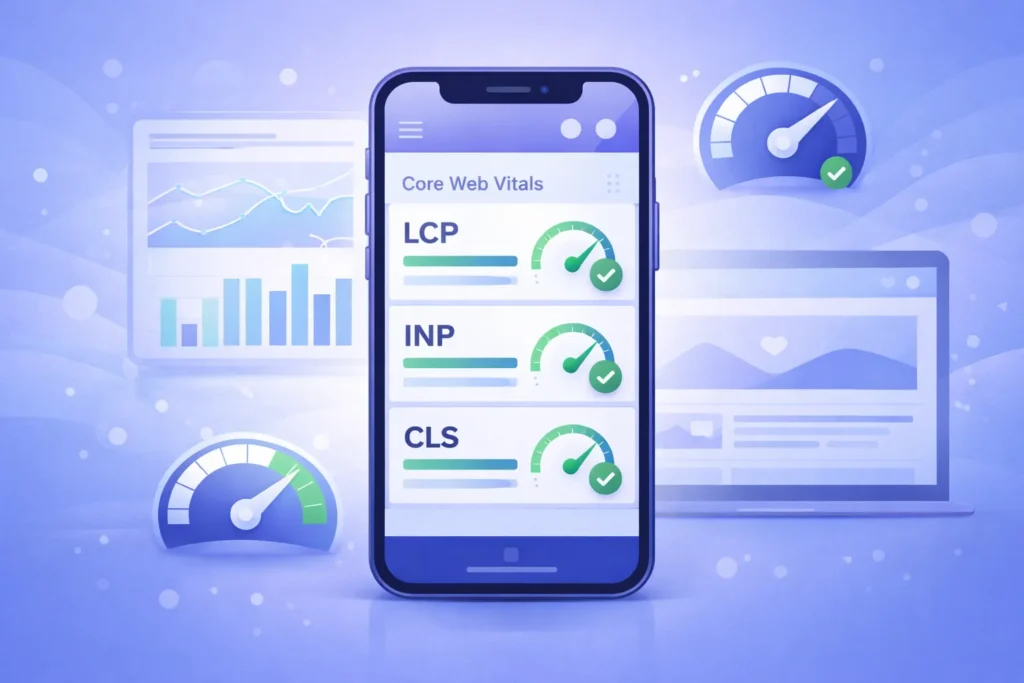
Image Optimization for Mobile
Images typically account for 50-70% of page weight, making them the biggest performance opportunity.
Modern image format adoption:
- WebP: 25-35% smaller than JPEG with similar quality
- AVIF: 50% smaller than JPEG, growing browser support
- SVG: Perfect for logos, icons, and simple graphics
Implementation strategy:
Copy<picture>
<source srcset="image.avif" type="image/avif">
<source srcset="image.webp" type="image/webp">
<img src="image.jpg" alt="Descriptive alt text" loading="lazy">
</picture>
Responsive images:
Copy<img srcset="small.jpg 480w, medium.jpg 768w, large.jpg 1200w"
 sizes="(max-width: 480px) 100vw, (max-width: 768px) 75vw, 50vw"
 src="medium.jpg" alt="Description">
Image optimization checklist:
- Compress images (aim for under 100KB per image)
- Serve images in next-gen formats
- Implement lazy loading for below-the-fold images
- Use responsive images with srcset
- Specify explicit width and height (prevents CLS)
- Use CDN for image delivery
- Optimize for mobile viewport sizes first
Code Optimization for Mobile Performance
CSS Optimization:
- Minify CSS files
- Remove unused CSS (use tools like PurgeCSS)
- Inline critical CSS for above-the-fold content
- Defer non-critical CSS
- Combine multiple CSS files to reduce HTTP requests
JavaScript Optimization:
- Minify and compress JavaScript
- Implement code splitting
- Defer non-critical JavaScript
- Use async loading for third-party scripts
- Remove unused JavaScript (tree shaking)
- Avoid large JavaScript frameworks when unnecessary
HTML Optimization:
- Minify HTML
- Reduce DOM complexity (aim for under 1,500 nodes)
- Use semantic HTML elements
- Implement proper heading hierarchy
- Remove unnecessary tags and attributes
Caching and Server Optimization
Browser Caching: Configure proper cache headers for static resources:
Cache-Control: public, max-age=31536000, immutable
Server-Side Optimization:
- Enable Gzip or Brotli compression (Brotli offers 15-20% better compression)
- Reduce Time to First Byte (TTFB) under 600ms
- Use HTTP/2 or HTTP/3 for multiplexing
- Implement server-side rendering (SSR) for dynamic content
- Consider edge computing with CDN
Content Delivery Network (CDN):
- Reduces latency by serving content from the nearest geographic location
- Provides automatic optimization features
- Offers DDoS protection and security benefits
- Handles traffic spikes without server overload
Mobile Conversion Rate Optimization
Streamlining Mobile Checkout
Mobile checkout abandonment rates average 85.65%, significantly higher than desktop. Optimization is critical for e-commerce success.
Mobile checkout best practices:
- Guest Checkout Option – Don’t force account creation
- Auto-fill Support – Implement HTML autocomplete attributes
- Mobile Payment Options – Apple Pay, Google Pay, PayPal
- Progress Indicators – Show users where they are in the process
- Minimal Form Fields – Request only essential information
- Error Prevention – Validate fields in real-time
- Trust Signals – Display security badges and guarantees
- Save Cart Functionality – Allow users to return later
Mobile form optimization:
- Use appropriate input types (tel, email, number, date)
- Implement large, tappable form fields
- Position labels above fields, not to the side
- Use placeholder text for format examples
- Enable password visibility toggle
- Auto-advance to next field when appropriate
- Display inline validation messages
Click-to-Call and Contact Optimization
Mobile users expect instant communication options:
Copy<a href="tel:+1234567890">(123) 456-7890</a>
Contact optimization strategies:
- Make phone numbers tappable, click-to-call links
- Position contact information prominently
- Offer multiple contact methods (call, text, chat, email)
- Implement click-to-text for SMS communication
- Add WhatsApp or Messenger integration
- Display business hours clearly
- Provide callback scheduling options
Mobile Landing Page Optimization
Essential elements of high-converting mobile landing pages:
- Benefit-Focused Headline – Immediately communicate value
- Concise Copy – 50% less text than desktop versions
- Single Clear CTA – One primary action per page
- Social Proof – Reviews, ratings, testimonials
- Fast Loading – Under 2 seconds for the highest conversions
- Minimal Navigation – Reduce exit opportunities
- Visual Hierarchy – Guide eyes to CTA
- Trust Elements – Security badges, guarantees, certifications
Testing and Monitoring Your Mobile Website
Essential Mobile Testing Tools
Mobile-Friendly Test Tool
This online checker instantly tells you whether a website works well on mobile devices. It gives a clear pass or fail result, highlights usability problems, and works perfectly for quick checks or client presentations.
PageSpeed Insights Tool
This performance testing tool measures website speed using real user data and simulated tests. It shows Core Web Vitals scores and suggests practical improvements for both mobile and desktop performance.
Search Console Dashboard
This platform monitors mobile usability across your entire site. It identifies mobile indexing issues, tracks Core Web Vitals from real users, and shows which pages meet modern mobile standards.
Lighthouse (Chrome DevTools)
- Comprehensive audits covering performance, accessibility, SEO, and PWA
- Runs locally in Chrome browser
- Detailed optimization opportunities with estimated savings
- Best for development and pre-launch testing
Real Device Testing: Don’t rely solely on emulators. Test on actual devices:
- iPhones (multiple iOS versions)
- Android devices (Samsung, Google Pixel, etc.)
- Different screen sizes (small, medium, large)
- Various network conditions (3G, 4G, 5G, WiFi)
- Different browsers (Chrome, Safari, Firefox, Edge)
Mobile Analytics and Monitoring
Key mobile metrics to track:
Traffic Metrics:
- Mobile vs. desktop traffic percentage
- Mobile-specific bounce rates
- Pages per session (mobile)
- Average session duration (mobile)
- Mobile traffic sources
Performance Metrics:
- Page load time (mobile)
- Core Web Vitals trends
- Mobile-specific error rates
- API response times
- Resource loading times
Conversion Metrics:
- Mobile conversion rate
- Mobile cart abandonment rate
- Click-to-call interactions
- Form completion rates
- Mobile revenue percentage
Engagement Metrics:
- Mobile scroll depth
- Touch/tap heatmaps
- Mobile video play rates
- App install rates (if applicable)
- PWA installation rates
Implementation tools:
- Google Analytics 4 (mobile-specific reporting)
- Hotjar or Crazy Egg (mobile heatmaps and recordings)
- Real User Monitoring (RUM) tools
- Custom event tracking for mobile interactions
- A/B testing tools with mobile optimization
Common Mobile Website Mistakes to Avoid
Critical Mistakes That Kill Mobile Performance
1. Intrusive Interstitials Google penalizes mobile pages with pop-ups that:
- Cover the main content immediately on entry
- Must be dismissed before accessing content
- Use standalone interstitials (not inline)
Allowed pop-ups:
- Legal requirements (age verification, cookie notices)
- Login dialogs for gated content
- Small, easily dismissible banners
2. Unplayable Content
- Avoid Flash (completely unsupported on mobile)
- Ensure videos use HTML5 with mobile-compatible formats
- Test all interactive elements on touch devices
- Provide mobile alternatives for desktop-only features
3. Faulty Redirects
- Don’t redirect mobile users to irrelevant pages (e.g., desktop homepage)
- Maintain URL structure across mobile and desktop
- Avoid redirect chains (multiple redirects to reach the destination)
- Implement proper 301 redirects when necessary
4. Small Touch Targets
- Buttons smaller than 44×44 pixels create user frustration
- Links too close together cause accidental taps
- Navigation menus with inadequate spacing
- Form checkboxes and radio buttons that are difficult to select
5. Non-Mobile-Friendly Pop-Ups
- Exit-intent pop-ups that trigger on scroll (annoying on mobile)
- Newsletter signups that obscure content
- Social media follow overlays
- Discount code pop-ups without easy dismissal
6. Horizontal Scrolling
- Content wider than the viewport requires annoying side-scrolling
- Tables that don’t adapt to mobile screens
- Images without max-width constraints
- Fixed-width containers
7. Slow Server Response Time
- Time to First Byte (TTFB) over 600ms
- Unoptimized database queries
- Inadequate hosting resources
- Lack of caching mechanisms
- Too many server requests
The Future of Mobile Web Design
Emerging Trends for 2026 and Beyond
5G Impact on Mobile Experiences. With 5G networks achieving widespread adoption, mobile web capabilities are expanding:
- Higher quality images and videos without performance penalties
- More sophisticated web applications
- Real-time collaborative features
- Enhanced AR and VR experiences on mobile web
- Reduced emphasis on extreme compression (though still important)
AI-Powered Personalization Machine learning enables unprecedented mobile personalization:
- Dynamic content adaptation based on user behavior
- Predictive search and navigation
- Personalized product recommendations
- Adaptive interfaces that learn user preferences
- Contextual experiences based on location, time, and behavior patterns
Foldable and Flexible Display Devices like Samsung Galaxy Z Fold and Microsoft Surface Duo require new design considerations:
- Multi-column layouts that adapt to unfolded screens
- App continuity between folded and unfolded states
- Flex-mode optimizations for partially folded positions
- Responsive website design that handles intermediate screen sizes
Dark Mode Optimization Dark mode is no longer optional:
Copy@media (prefers-color-scheme: dark) {
  body {
    background-color: #121212;
    color: #ffffff;
  }
}- Implement system-preference detection
- Provide a manual dark mode toggle
- Ensure sufficient contrast in dark mode
- Test all images and graphics in dark mode
- Consider OLED-specific optimizations
Voice-First Mobile Interfaces Voice interaction continues expanding beyond search:
- Voice-activated navigation
- Voice input for forms
- Voice commands for e-commerce
- Conversational interfaces for customer service
- Multi-modal experiences combining voice, touch, and visual elements
Implementation Roadmap: Making Your Website Mobile-Friendly
Phase 1: Assessment (Week 1)
Audit Current State:
- Run Google Mobile-Friendly Test
- Check PageSpeed Insights scores
- Review Google Search Console mobile usability reports
- Analyze mobile traffic and conversion data
- Test on multiple real devices
Identify Priority Issues:
- Critical mobile usability errors
- Core Web Vitals failures
- High-traffic pages with poor mobile performance
- Conversion bottlenecks in the mobile funnel
Phase 2: Foundation (Weeks 2-4)
Implement Responsive Design:
- Add viewport meta tag
- Convert fixed-width layouts to fluid grids
- Implement flexible images
- Create responsive navigation
- Ensure typography scales appropriately
Address Critical Performance Issues:
- Optimize the largest images
- Implement lazy loading
- Enable compression
- Minify CSS and JavaScript
- Establish browser caching
Phase 3: Optimization (Weeks 5-8)
Enhance Mobile UX:
- Improve touch target sizes
- Optimize form fields for mobile
- Implement click-to-call functionality
- Streamline mobile navigation
- Add mobile-specific CTAs
Technical SEO Implementation:
- Ensure mobile-desktop content parity
- Add structured data
- Optimize for voice search
- Implement mobile-specific schema
- Fix mobile crawl errors
Phase 4: Advanced Features (Weeks 9-12)
Consider PWA Implementation:
- Add service workers
- Create app manifest
- Implement offline functionality
- Add install prompts
- Enable push notifications
Accessibility Compliance:
- Conduct WCAG 2.2 audit
- Fix color contrast issues
- Improve screen reader compatibility
- Enhance keyboard navigation
- Add ARIA labels where necessary
Phase 5: Monitoring and Iteration (Ongoing)
Continuous Improvement:
- Monitor Core Web Vitals monthly
- Track mobile conversion metrics
- Conduct quarterly mobile UX audits
- Stay current with mobile SEO updates
- A/B test mobile design variations
Conclusion
Mobile-friendly websites are no longer optional—they’re fundamental to online success in 2026. With 59% of global traffic coming from mobile devices, Google’s mobile-first indexing prioritizing mobile versions, and mobile users expecting instant, seamless experiences, businesses cannot afford to ignore mobile optimization.
This comprehensive guide has covered the essential elements of mobile-friendly websites:
Mobile-first indexing and its impact on search rankings. Core Web Vitals performance metrics and optimization strategies, Progressive Web Apps for app-like mobile experiences, Mobile accessibility compliance with WCAG standards, Technical mobile SEO best practices, Mobile UX principles for maximum engagement, Performance optimization techniques for fast loading, Conversion optimization strategies for mobile users, Testing and monitoring approaches for continuous improvement
The investment in mobile optimization delivers measurable returns: higher search rankings, increased organic traffic, improved conversion rates, better user engagement, and enhanced competitive positioning.
Your next steps:
- Audit your current mobile performance using Google’s tools
- Identify critical issues affecting mobile users and rankings
- Implement responsive or mobile-first design as appropriate
- Optimize Core Web Vitals for better performance and SEO
- Ensure accessibility compliance to expand your audience
- Monitor continuously and iterate based on data
The mobile web continues evolving with 5G networks, AI personalization, voice interfaces, and new device formats. Staying ahead requires commitment to ongoing optimization, testing, and adaptation to emerging trends.
Ready to Make Your Website Mobile-Friendly and Boost Your SEO?
Don’t let poor mobile optimization cost you traffic, conversions, and competitive advantage. Our team specializes in responsive website design and conversion rate optimization to transform your mobile presence.
Take action today:
- Test your site with Google’s Mobile-Friendly Test
- Review your Core Web Vitals in Google Search Console
- Schedule a mobile optimization consultation
- Request a comprehensive mobile audit
The future is mobile-first. Make sure your website is ready.
faqs
A mobile-friendly website works smoothly on phones and tablets. It offers fast loading, easy navigation, readable text, and touch-friendly elements without zooming or scrolling sideways
Google uses mobile-first indexing. If your site isn’t mobile-optimized, rankings drop, visibility decreases, and organic traffic suffers—especially due to poor Core Web Vitals.
Responsive design adapts desktop layouts to smaller screens. Mobile-first design starts for mobile and scales up, often delivering faster performance and better user experience.
Core Web Vitals measure loading speed (LCP), interactivity (INP), and visual stability (CLS). Strong scores improve rankings, usability, and conversions.
Use Google’s Mobile-Friendly Test, PageSpeed Insights, and Google Search Console’s Mobile Usability report. Also, test on real mobile devices.
Mobile-first indexing means Google ranks your site based on its mobile version. Your mobile site must match desktop content and SEO data.
A PWA is a website that acts like an app. It loads fast, works offline, installs on devices, and offers SEO benefits at a lower cost than native apps.