
Getting traffic to your website is easy today. You can run ads, post on social media, or invest in SEO. But the real challenge starts when users land on your website.
Most businesses struggle here.
They get visitors, but those visitors do not convert into leads or customers. This is not because their product is bad. It is because their website has serious conversion mistakes.
A website should act like a salesperson. It should guide users, build trust, and push them toward action. But if your website is confusing, slow, or unclear, users leave without doing anything.
This blog will explain the biggest website conversion mistakes and how to fix them in a simple and practical way.
Why Conversion Mistakes Are Costing You Money
Many business owners think their problem is traffic. But in reality, the problem is conversion.
If your website is not converting, you are losing money every single day.
Here’s what happens when your website has conversion issues:
- Visitors leave without action
- The marketing budget gets wasted
- Sales remain low
- Brand trust decreases
- Competitors win your customers
A well-optimized website can turn the same traffic into more sales without increasing your budget.
Mistake 1: Poor User Experience (UX)
User experience is the foundation of your website. If users feel confused or frustrated, they will leave immediately.
People do not want to struggle while browsing. They want everything to be simple and fast.
When your website is hard to navigate, users lose interest quickly.
Common UX problems include:
- Complex navigation menus
- Too many steps to find information
- Unclear page structure
- Overloaded content
- Bad mobile usability
To fix UX issues, focus on simplicity and clarity.
- Keep navigation simple and clear
- Use proper headings and sections
- Reduce clutter
- Improve readability
- Make everything easy to find
A smooth user experience builds trust and keeps users engaged.
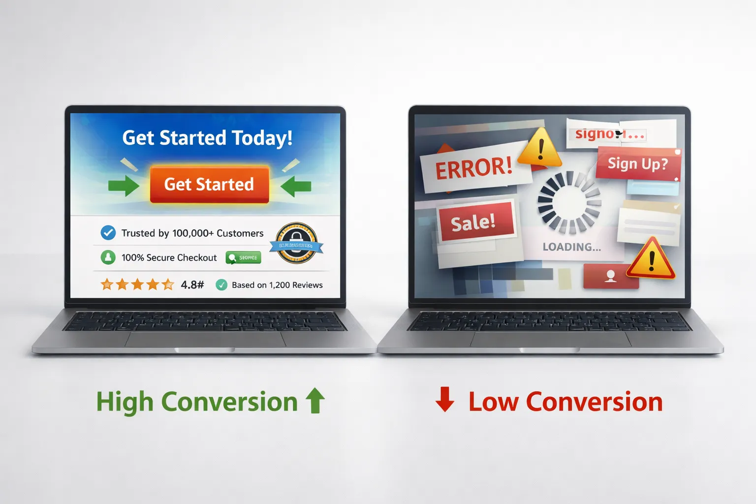
Mistake 2: Weak or Invisible CTA
A call-to-action is one of the most important elements on your website. It tells users what to do next.
If your CTA is weak, unclear, or hidden, users will not take action.
Many websites use generic CTAs like “Submit” or “Click Here.” These do not create any motivation.
A strong CTA should guide users clearly and create urgency.
Examples of high-converting CTAs:
- Get Your Free Quote
- Start Your Free Trial
- Book Your Appointment Now
- Download Your Free Guide
To improve your CTA:
- Use action-focused words
- Make it visually clear
- Place it above the fold
- Repeat it across the page
- Use contrasting colors
A powerful CTA can significantly increase your conversion rate.
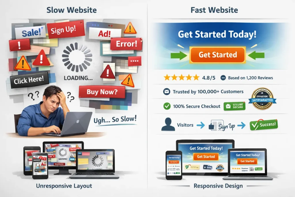
Mistake 3: Slow Website Speed
Speed is a critical factor in conversions.
Users expect websites to load instantly. If your website takes too long, they leave without waiting.
Even a small delay can reduce conversions.
Common causes of slow websites:
- Large image files
- Poor hosting
- Too many scripts
- Heavy design elements
To improve speed:
- Compress images
- Use fast and reliable hosting
- Minimize unnecessary code
- Enable caching
Fast websites create a better experience and increase conversions.
Mistake 4: No Trust Signals
Trust is one of the biggest factors in online sales.
If users do not trust your website, they will not buy from you.
Many websites fail because they look incomplete or unreliable.
Missing trust signals include:
- No customer reviews
- No testimonials
- No contact information
- No company details
- No security badges
To build trust:
- Add real customer testimonials
- Show reviews and ratings
- Display your contact details
- Use secure payment icons
- Add real business images
Trust signals reduce fear and increase conversions.
Mistake 5: Cluttered Website Design
A cluttered website confuses users.
Too many elements make it hard to focus. Users do not know where to look.
This leads to frustration and higher bounce rates.
Common design mistakes:
- Too many colors
- Too much text
- Multiple CTAs on one page
- Distracting animations
To improve design:
- Use white space
- Focus on one goal per page
- Keep the layout clean
- Highlight important elements
A simple design helps users take action faster.
Mistake 6: Not Mobile Optimized
Most users today browse on mobile devices.
If your website is not mobile-friendly, you lose a large percentage of potential customers.
Mobile users expect fast and smooth experiences.
Common mobile issues:
- Small text
- Buttons too close together
- Slow loading speed
- Broken layout
To fix mobile problems:
- Use responsive design
- Optimize images for mobile
- Increase button size
- Test your website on different devices
Mobile optimization directly impacts conversions.
Mistake 7: Weak Landing Pages
Landing pages are designed to convert visitors into leads or customers.
But many landing pages fail because they lack focus.
Users get confused when there are too many options.
Problems with weak landing pages:
- No clear headline
- No value proposition
- Too many distractions
- Weak CTA
To improve landing pages:
- Use a strong headline
- Focus on one goal
- Add a clear CTA
- Include social proof
A focused landing page improves results.
Mistake 8: No Clear Value Proposition
Your value proposition tells users why they should choose you.
If this is unclear, users leave.
People decide within seconds whether to stay or leave your website.
To create a strong value proposition:
- Clearly explain what you offer
- Highlight benefits
- Show what makes you different
- Keep it simple
Place your value proposition at the top of your page.
Mistake 9: Ignoring Data and Analytics
Many businesses make decisions based on guesses.
This leads to poor results.
You should always use data to improve your website.
Important metrics to track:
- Bounce rate
- Conversion rate
- Time on page
- User flow
Use tools like:
- Google Analytics
- Heatmaps
- Session recordings
Data helps you understand user behavior and improve conversions.
Mistake 10: Long and Complicated Forms
Forms are important for lead generation. But long forms reduce conversions.
Users do not want to spend too much time filling in details.
To optimize forms:
- Keep them short
- Ask only necessary questions
- Use autofill options
- Break long forms into steps
Simple forms increase completion rates.
Mistake 11: No A/B Testing
Without testing, you cannot improve.
Many businesses stick to one design without testing alternatives.
A/B testing helps you find what works best.
You can test:
- Headlines
- CTAs
- Colors
- Layouts
Even small changes can bring big improvements.
Mistake 12: Poor Content Structure
Content plays a major role in conversions.
If your content is hard to read, users will leave.
Walls of text are one of the biggest problems.
To improve content:
- Use short paragraphs
- Add headings
- Use bullet points
- Highlight key ideas
Readable content keeps users engaged
Mistake 13: Not Addressing Customer Problems
Your website should focus on the customer, not just your business.
If users do not see their problem being solved, they will leave.
To improve your content:
- Talk about customer pain points
- Provide clear solutions
- Show benefits
User-focused content converts better.
Mistake 14: No Urgency or Scarcity
If there is no urgency, users delay action.
They think they can come back later.
To create urgency:
- Use limited-time offers
- Add countdown timers
- Show limited availability
Urgency encourages faster decisions.
Mistake 15: Inconsistent Branding
Consistency builds trust.
If your website looks different on every page, users feel confused.
To maintain consistency:
- Use the same colors
- Use the same fonts
- Keep tone consistent
Strong branding improves credibility.
Conclusion
Website conversion mistakes are common but fixable.
You do not need more traffic. You need a better website.
When you fix:
- UX
- CTA
- Speed
- Trust
- Design
You can turn visitors into customers.
A high-converting website is simple, fast, and focused on users.
Faqs
These are issues in design, UX, or content that stop users from taking action like buying or signing up.
Improve UX, add strong CTAs, build trust, and optimize speed to increase conversions.
Good UX makes navigation easy, helping users stay longer and take action.
Clear, action-based wording with strong visibility increases clicks.
Yes, slow websites lead to higher bounce rates and lower conversions.
They reduce user doubt and increase confidence in your website.
CRO means improving your website to increase the number of users who take action.