
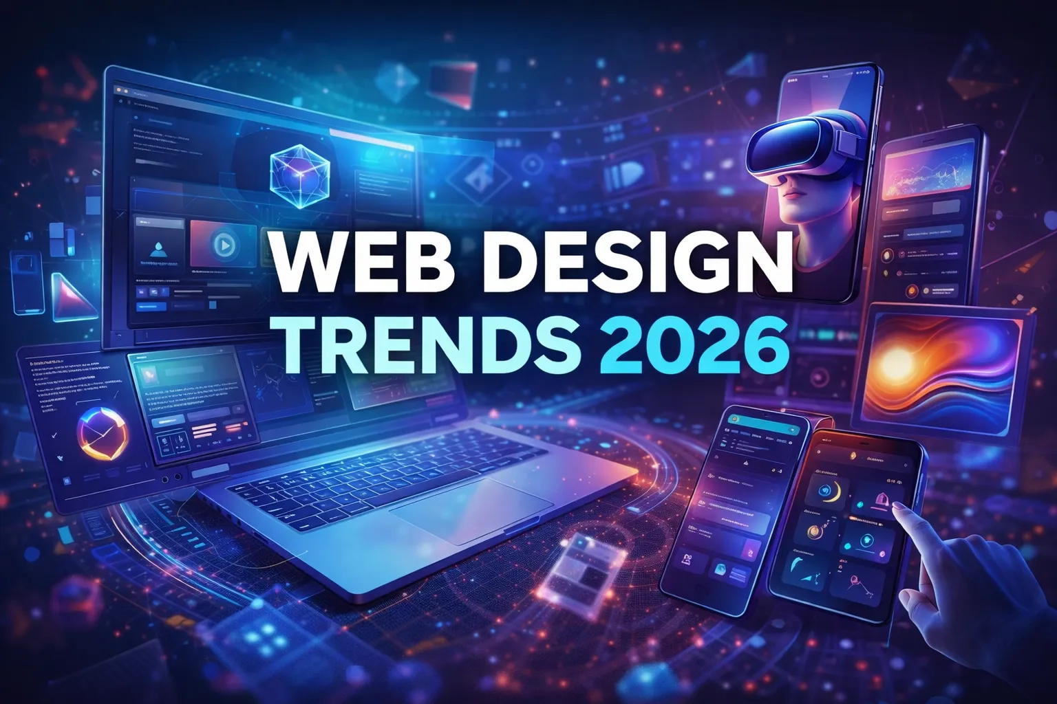
The web design landscape is undergoing its most significant transformation in years. After a decade dominated by clean minimalism and predictable layouts, 2026 marks a decisive shift toward personality, boldness, and human-centered experiences. The driving forces? Artificial intelligence reaching creative maturity, users craving authenticity over perfection, and technology finally catching up to designers’ ambitions.
This isn’t just about aesthetics changing—it’s about what websites can do and how they make people feel. From AI that collaborates rather than just generates, to interfaces that respond to voice and gesture, to design systems built for machines as much as humans, 2026 is rewriting the rules.
Whether you’re a designer, developer, business owner, or marketer, understanding these trends isn’t optional. The websites that win in 2026 will be those that balance cutting-edge technology with genuine human connection. This comprehensive guide covers everything you need to know—from visual aesthetics to technical implementation, from accessibility standards to sustainability practices.
Let’s explore what’s shaping the future of web design.
The Philosophy Shift: From Polish to Personality
Before diving into specific trends, it’s crucial to understand the underlying philosophical shift happening in web design. For years, the industry moved toward increasing polish—cleaner, more minimal, more refined. Every rough edge was smoothed. Every personality quirk was removed.
2026 represents a rebellion against that sterility. Designers are rediscovering that imperfection can be powerful, that boldness beats blandness, and that users connect with websites that feel human rather than machine-generated.
This doesn’t mean abandoning professionalism or good UX principles. Instead, it means finding space for character within structure, for playfulness within purpose, for emotion within efficiency. The best websites of 2026 will master this balance—technically excellent but unmistakably human.
Visual & Aesthetic Trends
1. AI Takes Over the Canvas: From Tool to Creative Partner
Artificial intelligence has moved from experimental novelty to production necessity. In 2026, AI isn’t just generating images or writing copy—it’s integrated into the entire design workflow, functioning as a creative collaborator rather than a simple automation tool.
The transformation is profound. Designers now work with AI systems that suggest layout variations, generate component libraries, produce multiple design directions simultaneously, and even adapt interfaces in real-time based on user behavior. Tools like Midjourney, Stable Diffusion, and ChatGPT have evolved beyond their 2024 capabilities, now offering seamless integration with design platforms like Figma, Webflow, and Adobe XD.
What makes 2026 different is the shift from prompt-and-wait to continuous collaboration. AI observes your design decisions, learns your style preferences, and proactively suggests improvements. It handles repetitive tasks—resizing assets, generating variations, creating responsive breakpoints—while you focus on strategic creative direction.
The biggest impact? Speed. What once took days now takes hours. Ideas can be tested rapidly, iterations multiply, and creative exploration expands dramatically. But this speed creates a new challenge: maintaining originality when everyone has access to the same powerful tools. The winners will be those who use AI to amplify their unique creative voice, not replace it.
Implementation tip: Start by using AI for ideation and rapid prototyping, but always add your human touch to final designs. Let AI handle the variations; you handle the vision.
2. The Return of Retro and Brutalism: Embracing Imperfection
When AI-generated design threatens to make everything look polished and similar, designers are swinging hard in the opposite direction. Brutalism and retro aesthetics are experiencing a major revival, celebrating rawness, asymmetry, and deliberate imperfection.
Brutalist web design strips away unnecessary decoration, exposing the raw structure of HTML and CSS. Think visible grid systems, unstyled elements, heavy monospace typography, stark black-and-white contrasts, and layouts that feel deliberately unpolished. It’s the architectural equivalent of exposed brick and concrete—honest, uncompromising, and unapologetically bold.
Retro design, meanwhile, pulls from Y2K aesthetics, early internet nostalgia, 90s graphic design, and analog media textures. Pixelated graphics, gradient meshes, chunky borders, and vibrant color clashes create a sense of playful rebellion against corporate blandness.
These trends work particularly well for creative agencies, independent artists, tech startups with counterculture positioning, and brands targeting younger, design-savvy audiences. They signal authenticity and confidence—brands willing to break conventions and stand out rather than blend in.
The key is intentionality. Random ugliness isn’t brutalism; it’s just bad design. True brutalist and retro design requires careful consideration of hierarchy, readability, and user experience. The chaos is controlled, the rawness is refined.
Implementation tip: Use brutalist elements strategically—perhaps in your hero section or navigation—while maintaining usability elsewhere. Balance boldness with accessibility.
3. Organic Shapes and Anti-Grid Layouts: Humanizing Digital Spaces
After years of rigid grid systems and perfect alignment, designers are breaking free. Organic shapes, flowing lines, irregular layouts, and soft, asymmetric compositions are making websites feel more natural and approachable.
This trend reflects a broader desire to humanize digital experiences. Curved edges feel softer than sharp corners. Asymmetry feels more natural than perfect symmetry. Flowing layouts mimic nature rather than machinery. These subtle psychological effects make users feel more comfortable and engaged.
Technically, this is enabled by advances in CSS Grid and Flexbox, which give designers unprecedented control over layout without relying on traditional columnar structures. SVG shapes, clip-paths, and CSS masks allow for complex organic forms that respond fluidly to different screen sizes.
Organic design works beautifully for wellness brands, creative portfolios, environmental organizations, lifestyle products, and any brand wanting to emphasize warmth and approachability. It softens the often cold, mechanical feel of digital interfaces.
The challenge is maintaining clarity and usability within organic layouts. Users still need clear visual hierarchy, obvious navigation, and predictable interaction patterns. The best organic designs feel natural without being confusing.
Implementation tip: Start with subtle organic elements—rounded corners, soft gradients, gently curved dividers—before attempting fully asymmetric layouts. Test extensively on mobile devices.
4. Goodbye Beige, Hello Bold: The Color Revolution
Minimalism’s reign brought muted palettes, safe neutrals, and endless variations of gray and beige. That era is ending. Bold, saturated colors are making a dramatic comeback.
Expect to see vibrant gradients spanning multiple hues, high-contrast color blocking, unexpected color combinations, neon accents and glowing effects, and expressive, emotion-driven palettes that feel more like modern art than corporate websites.
This shift is partly a reaction to years of sameness—when every website looks like every other website, color becomes a powerful differentiator. It’s also enabled by better screen technology (OLED displays that handle bright colors beautifully) and improved understanding of digital accessibility (bold colors can still meet WCAG contrast requirements).
Psychologically, bold colors communicate confidence, creativity, and modernity. They grab attention in crowded feeds and make brands memorable. For industries traditionally dominated by conservative design—finance, healthcare, legal—bold color can be particularly disruptive and effective.
The key is a purposeful color strategy. Random brightness doesn’t work; intentional color systems do. Colors should align with brand identity, support hierarchy, and consider cultural contexts.
Implementation tip: Use bold colors strategically as accents and focal points rather than overwhelming entire layouts. Maintain sufficient contrast for accessibility while embracing vibrancy.
5. Typography That Breathes and Moves: Kinetic Text Experiences
Static typography is no longer enough. Variable fonts, animated text, kinetic typography, and text that responds to user interaction are transforming how we communicate through type.
Variable fonts are the technical foundation—single font files that contain multiple weights, widths, and styles that can shift dynamically. This enables text that changes weight on hover, expands or condenses based on screen size, animates smoothly between styles, or responds to scroll position or mouse movement.
The effect is dramatic. Headlines can breathe and pulse. Text can react to audio or video. Typography becomes part of the interface, not just what’s written in it. This creates moments of delight and emphasizes important messages in memorable ways.
Major type foundries are now releasing variable font families specifically designed for web use. Browser support is excellent. The technology is ready; the challenge is using it purposefully rather than gratuitously.
Kinetic typography works particularly well for brand storytelling, product launches, portfolio hero sections, and interactive editorial content. It’s less appropriate for body copy or situations requiring quick scanning.
Implementation tip: Reserve animated typography for headlines and key messages. Ensure text remains readable throughout animations. Provide options to reduce motion for users with vestibular disorders.
6. Glassmorphism: The Aesthetic of Future Interfaces
Glassmorphism creates frosted-glass effects using transparency, backdrop blur, subtle borders, and layered depth. The result is a modern, ethereal aesthetic that feels simultaneously futuristic and approachable.
First popularized by Apple’s design language and Windows’ Fluent Design System, glassmorphism has evolved from a trendy effect into a mature design pattern. In 2026, it’s being used more strategically—for navigation elements that float over content, modal windows and overlays, card-based layouts, and UI components that need visual hierarchy without harsh borders.
Glassmorphism works because it creates depth without heaviness. Elements feel light and floating rather than boxed and constrained. It’s particularly effective for applications and sites with rich visual backgrounds, allowing UI elements to stand out while not completely obscuring the content beneath.
The technical implementation relies on CSS backdrop-filter, which now has excellent browser support. The challenge is performance—blur effects can be computationally expensive on lower-end devices. Smart designers use glassmorphism selectively and optimize carefully.
Implementation tip: Use glassmorphism for floating UI elements and overlays rather than entire layouts. Test performance on mobile devices and provide fallbacks for browsers that don’t support backdrop-filter.
7. Creative Process Transparency: Showing the Work Behind the Work
Users increasingly want to see how things are made. The Creative Process trend celebrates this curiosity by incorporating hand-drawn elements, work-in-progress aesthetics, sketches and wireframes as design elements, collaged materials, and behind-the-scenes content directly into finished designs.
This trend works because it builds trust and connection. When visitors see the human process behind a polished result, they feel more connected to the creator. It signals authenticity in an age of AI-generated content and corporate polish.
Technically, this often means incorporating scanned textures, photographed sketches, layered compositions that reveal process, and even documentation of design iterations. The aesthetic is deliberately imperfect—pencil marks, eraser smudges, annotation marks, and all.
This approach is particularly powerful for creative professionals, studios and agencies, educational content, and products where craft and process are part of the value proposition.
Implementation tip: Integrate process elements strategically in about sections, case studies, or portfolio pieces. Balance raw authenticity with professional polish.
Technical & Interactive Trends
8. Responsive 3D That Actually Feels Alive
3D on the web has evolved from decorative to functional. In 2026, lightweight frameworks like Spline, React Three Fiber, and Three.js make it possible to build truly interactive 3D experiences that respond to user input, adapt to screen size, and run smoothly even on mobile devices.
The difference from earlier 3D web experiments is responsiveness and purpose. Objects tilt and rotate with mouse movement, products can be examined from every angle, environments react to scroll position, and 3D elements integrate seamlessly with 2D layouts. It’s not about showing off technical capability—it’s about creating intuitive, engaging interfaces.
The applications are expanding rapidly: E-commerce product visualization, architectural and real estate tours, educational demonstrations, gaming and entertainment experiences, and data visualization in three dimensions.
Modern 3D web tools have dramatically lowered the barrier to entry. Designers without extensive coding knowledge can create sophisticated 3D experiences using visual editors, then embed them directly into websites. Performance optimization has improved dramatically, making these experiences viable for real-world use.
Implementation tip: Start with simple 3D elements—a rotating logo, a tiltable product—before attempting full environments. Prioritize load time and provide 2D fallbacks for older devices.
9. WebGL for Everyone: Democratizing Advanced Graphics
WebGL—the technology behind advanced web graphics—was once the domain of specialized developers. In 2026, no-code and low-code tools have made it accessible to designers.
Platforms like Unicorn Studio, Rive, and visual shader editors allow designers to create liquid distortions, particle effects, glowing and lighting effects, magnetic cursor interactions, and complex visual effects without writing shader code.
The impact is significant. Effects that once required custom Shopify Development and large budgets are now achievable in hours rather than weeks. This democratization means more websites can incorporate high-end graphics, creating a general elevation in visual sophistication across the web.
The challenge is restraint. Just because you can add particle effects everywhere doesn’t mean you should. The best implementations use WebGL effects purposefully—to draw attention to key elements, create memorable moments, or reinforce brand identity.
Implementation tip: Use WebGL effects as accents and focal points. Test performance across devices. Provide options to disable effects for users who prefer reduced motion.
10. Micro-Animations Growing Up: Functional Motion Design
Micro-animations have matured from novelty to necessity. In 2026, they’re understood as essential UX elements that provide feedback, guide attention, smooth transitions, and create delight.
The focus has shifted to functional animation—movement with purpose. Button states that provide tactile feedback, form fields that gently indicate focus, loading indicators that reduce perceived wait time, scroll animations that reveal content progressively, and hover effects that clarify interactive elements.
Modern animation libraries like Framer Motion, GSAP, and React Spring make sophisticated animations accessible to developers at all skill levels. CSS animations have also become more powerful, enabling complex effects with minimal code.
The key is subtlety and purpose. Animations should enhance usability, not distract from content. They should feel natural, not mechanical. The best micro-animations are almost invisible—users don’t consciously notice them, but they make the experience feel smoother and more intuitive.
Accessibility is crucial. Always respect prefers-reduced-motion settings and provide alternatives for users with vestibular disorders who find motion uncomfortable or disorienting.
Implementation tip: Audit every animation for purpose. If it doesn’t improve usability or communicate important information, remove it. Keep animations under 300ms for interactive elements.
11. Sound Design Integration: The Web Learns to Speak
Sound is quietly becoming an essential element of web design. Subtle audio feedback, ambient soundscapes, branded audio signatures, and voice interactions are adding a new dimension to digital experiences.
The best implementations use sound purposefully: Click sounds that provide tactile feedback, notification tones that grab attention without being intrusive, ambient loops that set emotional tone, and voice interfaces that enable hands-free interaction.
AI has made sound design more accessible. Tools can now generate sound effects, create adaptive audio that responds to user behavior, and even compose background music matched to brand identity. This democratization means smaller teams can incorporate professional-quality audio.
The challenge is respecting user preferences. Sound should default to off or be very subtle, with clear controls for users who want it. Consider that many users browse with sound muted, in public spaces, or in situations where audio isn’t appropriate.
Implementation tip: Make all audio optional and user-initiated. Use sound to enhance existing visual feedback, not replace it. Keep volumes low and effects brief.
12. The Human Layer: Beyond Mouse and Keyboard
Web interfaces are expanding beyond traditional input methods. Voice control, gesture recognition, facial expression detection, and gaze tracking are gradually becoming part of the web design toolkit.
This shift is enabled by advances in browser APIs and AI. MediaPipe and similar frameworks make it possible to detect hand gestures, facial landmarks, and body pose directly in the browser. Web Speech API enables voice input and output. Eye-tracking APIs are emerging.
The applications are still evolving: Voice navigation for accessibility, gesture controls for immersive experiences, facial recognition for security, emotion detection for adaptive interfaces, and hands-free operation in specific contexts.
This trend is more about direction than immediate universal adoption. The Human Layer will unfold gradually as technologies mature and users become comfortable with new interaction paradigms. Early adopters will gain a competitive advantage by offering more intuitive, accessible experiences.
Implementation tip: Treat alternative input methods as enhancements, not requirements. Always provide traditional mouse/keyboard alternatives. Be transparent about what data is being collected.
13. Design Tokens: Building Scalable Design Systems
Design tokens are becoming the foundation of modern design systems. Rather than hardcoding colors, typography, spacing, and other design values throughout a codebase, tokens store these values as reusable, named variables.
The benefits are substantial: Update a single token to change values globally, ensure consistency across platforms and products, create seamless designer-developer handoffs, enable theme switching (light/dark mode, brand variations), and maintain design systems at scale.
In 2026, design tokens have evolved from a developer tool to a standard practice. Platforms like Figma now support token creation and export natively. CSS custom properties provide the technical foundation. Tools like Style Dictionary enable token transformation across platforms.
This approach is particularly valuable for agencies managing multiple clients, enterprise teams coordinating across departments, products requiring white-label variations, and any project expecting to scale or evolve.
Implementation tip: Start by tokenizing colors and typography, then expand to spacing, sizing, and other properties. Use semantic naming (primary-color, not blue-500) for flexibility.
14. Hyper-Personalized Web Journeys: Adaptive Experiences
Personalization has evolved beyond inserting a user’s name into copy. In 2026, websites adapt in real-time based on behavior patterns, device and location context, user preferences and history, referral source and campaign data, and role or segment.
This enables experiences where navigation adjusts based on behavior, content prioritizes relevant information, product recommendations feel genuinely useful, CTAs target specific needs and interests, and every visitor sees a version optimized for them.
The technology is largely AI-driven—machine learning algorithms analyze patterns and predict preferences, then dynamically adjust layouts, content, and functionality. This happens behind the scenes, creating the impression of a site that just “gets” each visitor.
Privacy is the critical challenge. Personalization requires data, but users are increasingly protective of their information. The best implementations are transparent about data usage, give users control over personalization, and focus on contextual adaptation rather than invasive tracking.
Implementation tip: Start with simple personalization based on publicly available context (device type, time of day, referral source) before implementing user-specific tracking. Be transparent and provide opt-out options.
Strategic & Business Trends
15. Accessibility as Creative Default: Design for Everyone
Accessibility is no longer a late-stage checklist item—it’s a fundamental design principle. The European Accessibility Act, updated WCAG standards, increased legal pressure, and cultural emphasis on inclusion have made accessibility both legally required and ethically essential.
2026’s approach is accessibility-first design: keyboard navigation designed from the start, color contrast tested in early mockups, screen reader compatibility built into components, captions and transcripts provided for all media, and a responsive design that works for all abilities.
The shift in thinking is crucial. Accessibility isn’t a constraint on creativity—it’s a driver of better design for everyone. A clear hierarchy helps all users navigate efficiently. Sufficient contrast makes content readable in any lighting. Keyboard access benefits power users and people with mobility differences alike.
Modern tools make accessibility easier. Automated scanners identify common issues, browser DevTools include accessibility audits, design systems can embed accessible patterns, and AI can generate alt text and captions at scale.
Implementation tip: Use accessibility scanners during Website Development, not after. Test with actual screen readers and keyboard navigation. Follow WCAG 2.2 AA standards as a minimum baseline.
16. Sustainable and Ethical Web Design: Better for People and Planet
The environmental and ethical impact of digital experiences is finally getting serious attention. Sustainable web design focuses on reducing energy consumption, minimizing data transfer, choosing green hosting providers, and optimizing code efficiency.
Every page load consumes energy. Multiply that by millions of visitors, and websites have real environmental footprints. Sustainable design practices reduce this impact through image optimization and lazy loading, efficient code without bloat, minimal third-party scripts, server-side rendering where appropriate, and thoughtful use of video and animation.
Ethical web design extends this thinking to data practices: transparent privacy policies, minimal data collection, user control over information, honest dark pattern-free UX, and accessible content for all users.
This isn’t just altruism—it’s strategic. Users increasingly choose brands aligned with their values. Sustainable websites load faster, rank better, and cost less to operate. Ethical practices build trust and reduce legal risk.
Implementation tip: Audit your site’s carbon footprint using tools like Website Carbon Calculator. Optimize images aggressively. Choose hosting providers powered by renewable energy.
17. Performance-First Creativity: Beautiful Design at Speed
Site speed has become a non-negotiable requirement. Core Web Vitals directly impact search rankings, load time affects conversion rates, performance determines user satisfaction, and mobile users expect desktop-fast experiences.
The 2026 approach is performance-first creativity—designing beautiful, engaging experiences within performance constraints. This means thoughtful image SEO optimization, lazy loading for off-screen content, efficient animation that doesn’t block rendering, minimal JavaScript where possible, and mobile-first responsive design.
The tools have improved dramatically. Next-gen image formats (WebP, AVIF) provide better compression. Content delivery networks (CDNs) distribute assets globally. Build tools automatically optimize code. Performance monitoring identifies bottlenecks in real-time.
The key insight: performance is a feature, not a technical detail. Fast sites feel more professional, trustworthy, and polished. Users consciously notice slow sites but subconsciously appreciate fast ones.
Implementation tip: Set performance budgets before designing. Use tools like Lighthouse and WebPageTest throughout development. Optimize images ruthlessly—they’re usually the biggest performance killer.
18. Brand Storytelling Through Design: Building Emotional Connections
Transactional websites are losing to experiential ones. In 2026, the most successful sites tell stories through narrative-driven layouts, interactive story elements, video integration, scroll-triggered revelations, and emotional design principles.
This approach transforms websites from information displays into immersive experiences. Rather than presenting features, sites reveal journeys. Instead of listing benefits, they create emotional moments. Users don’t just read content—they experience it.
The technical execution combines multiple trends: scroll-triggered animations that unfold stories, video backgrounds that set emotional tone, interactive elements that encourage exploration, progressive disclosure that builds anticipation, and thoughtful pacing that mimics narrative structure.
This works particularly well for brand sites, creative portfolios, product launches, nonprofit campaigns, and any context where emotional connection drives outcomes.
Implementation tip: Map your brand story before designing. Identify key emotional beats. Use design elements to support narrative arc, not just fill space.
19. Connected Business Stack: Website as Command Center
Websites are evolving from digital brochures into operational hubs. The connected business stack integrates e-commerce systems, marketing automation, CRM and customer data, analytics and reporting, inventory management, and communication tools into unified experiences.
This transformation means websites don’t just display information—they run businesses. Orders are processed, leads are nurtured, customers are supported, data flows seamlessly, and teams work from shared truth.
The technical infrastructure involves API integrations between platforms, headless CMS architectures that separate content from presentation, marketing automation triggered by user behavior, real-time inventory and pricing updates, and unified customer profiles across touchpoints.
The benefits are enormous: reduced manual work and errors, faster response to market changes, better customer experiences, data-driven decision making, and scalability without proportional cost increases.
Implementation tip: Start with critical integrations—usually e-commerce and email marketing. Use iPaaS tools like Zapier or Make to connect systems without custom development. Plan for scalability from the beginning.
20. From UX to MX: Designing for Machine Experience
As AI search and generative agents replace traditional browsing, designers must consider how machines interpret websites, not just how humans view them. This is the emerging concept of Machine Experience (MX)—designing for AI systems that read, interpret, and summarize web content.
The implications are significant: semantic HTML becomes crucial for AI understanding, structured data markup enables accurate interpretation, clear hierarchy helps AI extract key information, content organization affects AI summaries, and design decisions impact how sites are represented in AI-generated responses.
This doesn’t mean abandoning visual design—it means ensuring the underlying structure is as thoughtful as the surface appearance. Sites must work for both human eyes and machine comprehension.
Some call this the Parallel Web—a version of the internet optimized for AI agents rather than human browsers. As more traffic comes from AI tools rather than direct visits, this parallel version becomes increasingly important.
Implementation tip: Use semantic HTML5 elements properly. Implement schema.org structured data. Ensure content hierarchy is logical in source code, not just visual design.
Implementation: Bringing Trends to Life
Start with Strategy
Focus on your audience, brand, goals, technical limits, and competition. Choose trends that align—don’t follow them blindly.
Prioritize User Experience
Trends should improve clarity, usability, accessibility, and emotional connection. Decoration without function isn’t design.
Balance Innovation with Familiarity
Introduce fresh ideas while keeping navigation, buttons, and forms recognizable.
Implement Progressively
Adopt one or two trends at a time. Master them before adding more.
Optimize for Performance
Ensure fast loading by optimizing images, minimizing scripts, using caching, and testing on real devices.
Test Across Contexts
Check usability across devices, lighting, connections, and assistive tools with real users.
Stay Current
Follow WCAG, Core Web Vitals, browser updates, and design resources to stay updated.
Tools and Technologies for 2026
Design Platforms
- Figma: Industry-standard collaborative design tool with growing support for design tokens, variables, and advanced prototyping
- Webflow: A visual web design platform enabling designers to build production sites without coding
- Elementor: WordPress builder with extensive AI integration and design system capabilities
- Adobe XD: Feature-rich prototyping tool with strong Adobe Creative Cloud integration
AI Tools
- ChatGPT/Claude: Content generation, coding assistance, design feedback
- Midjourney/DALL-E: AI image generation for concepts and assets
- Runway: AI video generation and editing
- ElevenLabs: AI voice generation for audio interfaces
3D and Animation
- Spline: Accessible 3D design tool for web experiences
- React Three Fiber: Three.js integration for React developers
- Rive: Interactive animation tool with runtime support
- GSAP: Professional-grade JavaScript animation library
Development Frameworks
- Next.js/React: Modern web application framework with excellent performance optimization
- Vue/Nuxt: Progressive JavaScript framework with a gentle learning curve
- Svelte/SvelteKit: Compiled framework with minimal runtime overhead
- Astro: Static site generator optimized for performance
Accessibility Tools
- WAVE: Browser extension for accessibility evaluation
- axe DevTools: Automated accessibility testing
- Lighthouse: Google’s tool for performance and accessibility audits
- VoiceOver/NVDA: Screen readers for testing
Performance Tools
- WebPageTest: Detailed performance analysis
- ImageOptim: Image compression tool
- Cloudflare: CDN and performance optimization
- Vercel/Netlify: Edge hosting with automatic optimization
Avoiding Trend Fatigue
Trends come and go, but good design endures. Here’s how to engage with trends without letting them dominate your work.
Focus on Principles Over Trends
The fundamentals never change: clear hierarchy, strong contrast, consistent spacing, purposeful white space, and user-centered thinking. Master principles first; trends second.
Consider Longevity
Will this trend still feel fresh in two years? Some trends have staying power (accessibility, performance), while others are momentary (specific aesthetic flourishes). Invest more heavily in enduring approaches.
Maintain Brand Consistency
Trends should enhance your brand identity, not replace it. If a trend doesn’t align with who you are, skip it. Consistency builds recognition and trust.
Budget for Updates
Web design isn’t set-it-and-forget-it. Budget time and resources for regular updates. Sites typically need significant refreshes every 2-3 years and minor updates more frequently.
Learn Continuously
The pace of change requires continuous learning. Follow industry leaders, experiment with new tools, attend conferences and webinars, read design blogs, and participate in design communities.
Case Studies: Trends in Action
Example 1: E-Commerce Product Visualization
A furniture retailer implemented responsive 3D using Spline, allowing customers to rotate and examine products from every angle. The result: 35% reduction in returns and 28% increase in conversion rates. The 3D viewer loaded in under 2 seconds and worked smoothly on mobile devices, proving that advanced features can coexist with performance.
Example 2: Creative Agency Brutalism
A design studio embraced brutalist aesthetics with exposed grids, bold typography, and raw black-and-white layouts. While unconventional, the approach perfectly communicated their brand positioning as bold and unconventional. They maintained accessibility through strong contrast and clear hierarchy, proving brutalism doesn’t mean abandoning usability.
Example 3: Nonprofit Storytelling
An environmental organization used scroll-triggered narrative design to tell the story of climate impact. As users scrolled, illustrations animated, statistics appeared progressively, and the emotional journey built to clear action points. Time on site increased by 85%, and donation conversions improved by 42%.
Example 4: SaaS Personalization
A B2B software company implemented role-based personalization, showing different headlines, case studies, and features based on visitor industry and company size. Marketing qualified leads increased by 56% as visitors found immediately relevant content rather than generic messaging.
Example 5: Sustainable Redesign
An online publisher reduced their site’s carbon footprint by 70% through aggressive image optimization, lazy loading, and simplified design. Page load time dropped from 8 seconds to 1.5 seconds. Bounce rate decreased by 32%, and ad revenue actually increased due to better user engagement.
Looking Beyond 2026: What’s Next
While 2026 trends are still unfolding, several signals point to what might come next.
Spatial Computing and WebXR
As VR/AR devices become more mainstream, web experiences may extend into three-dimensional space. WebXR APIs enable these experiences directly in browsers without apps.
AI-Generated Real-Time Interfaces
Future websites might generate interfaces on the fly, creating truly unique experiences for each visitor based on their specific needs and context.
Biometric Adaptation
Interfaces that respond to heart rate, stress levels, attention patterns, or emotional state could create unprecedented personalization—though privacy concerns will need careful navigation.
Quantum Computing Impact
As quantum computing becomes more accessible, computationally impossible features (perfect personalization, instant global search, real-time language processing) might become standard.
Environmental Regulation
Legal requirements around digital carbon footprints may emerge, making sustainable design not just ethical but mandatory.
The constant across all these futures: human-centered thinking will remain essential. Technology changes rapidly, but people’s fundamental needs for clarity, connection, and meaning endure.
Conclusion
Web design in 2026 is more exciting, more capable, and more important than ever. The convergence of AI, improved browser capabilities, better tools, and cultural emphasis on authenticity creates unprecedented opportunities for designers willing to push boundaries thoughtfully.
The trends outlined here aren’t prescriptions—they’re possibilities. Your job is to evaluate them critically, select those that serve your users and goals, and implement them in ways that feel authentic to your brand.
The biggest trends include AI-powered design, bold visuals, brutalism, organic layouts, kinetic typography, responsive 3D, accessibility-first design, personalization, and performance-focused creativity that balances technology with human experience.
AI now acts as a creative partner, helping designers generate layouts, design variations, content, and personalization faster while allowing humans to focus on strategy, storytelling, and emotional connection.
Minimalism is no longer dominant. In 2026, designers are moving toward expressive, personality-driven designs while still maintaining clarity, usability, and strong UX principles.
Accessibility ensures websites work for everyone, including users with disabilities. In 2026, accessibility is both a legal requirement and a design standard that improves usability, SEO, and overall user experience.
Modern web design focuses on performance-first creativity—creating visually rich experiences that load fast, meet Core Web Vitals, improve SEO rankings, and increase conversions without sacrificing aesthetics.
Websites in 2026 adapt content, layouts, and CTAs based on user behavior, device, and context, creating tailored experiences that improve engagement while respecting privacy and transparency.
Businesses should adopt trends strategically, prioritize user experience, maintain brand consistency, optimize performance, ensure accessibility, and implement changes progressively rather than following trends blindly.