
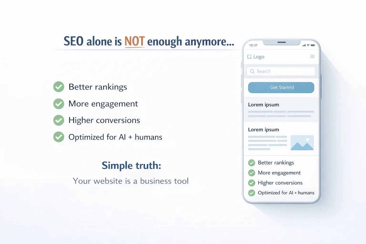
What is a Mobile-Friendly Site?
A mobile-friendly site is a website that works smoothly on smartphones and tablets. It adjusts its layout, images, and content automatically to fit smaller screens.
We design mobile-friendly sites to ensure users can:
- Read content without zooming
- Navigate easily
- Load pages quickly
- Interact without frustration
Today, mobile devices dominate internet usage. If your website is not optimized for mobile, you are losing a large portion of your audience.
Why Does Every Business Need a Mobile-Friendly Site?
We live in a mobile-first world. Most users browse, shop, and search using their phones.
A mobile-friendly site helps businesses:
- Reach more users
- Improve engagement
- Increase trust
- Generate more leads
Without mobile optimization, your website creates a poor experience. Users leave quickly, and you lose potential customers.
Mobile Usage Statistics You Should Know
Understanding user behavior is important.
- Over 60–70% of web traffic comes from mobile devices
- Users spend more time on mobile than on desktop
- Mobile users expect pages to load within 2–3 seconds
We have seen that slow or unresponsive websites lose visitors instantly.
How a Mobile-Friendly Site Improves SEO
Search engines prioritize mobile-friendly websites.
We optimize mobile-friendly sites to:
- Improve search rankings
- Reduce bounce rate
- Increase dwell time
When users stay longer on your site, search engines see it as a positive signal.
What Happens If Your Site is not mobile-friendly?
Ignoring mobile optimization can hurt your business.
Common problems include:
- High bounce rate
- Low engagement
- Poor rankings
- Lost revenue
We have seen businesses lose up to 50% of their traffic due to a poor mobile experience.
Key Features of a Mobile-Friendly Site
We focus on essential features to create effective mobile-friendly websites.
Responsive Design
Your website development adapts to different screen sizes automatically.
Fast Loading Speed
Speed is critical. Users leave slow websites.
We optimize:
- Images
- Code
- Server performance
Easy Navigation
Menus should be simple and accessible.
Readable Content
We use:
- Short sentences
- Clear headings
- Proper spacing
Mobile-Friendly Buttons
Buttons should be easy to click without zooming.
How a Mobile-Friendly Site Improves Conversions
A better user experience leads to more conversions.
We have observed:
- Increased sales
- More leads
- Higher engagement
Users trust websites that are easy to use.
E-E-A-T: Why Trust Matters
Search engines evaluate trust and credibility.
We build trust by:
- Showing real experience
- Using expert knowledge
- Providing accurate information
- Maintaining transparency
Adding an About Us page and author details improves credibility.
Mobile UX (User Experience) Explained
User experience plays a major role.
We improve UX by:
- Reducing clutter
- Improving readability
- Simplifying navigation
A good experience keeps users engaged.
Best Practices for Mobile Optimization
Follow these strategies:
- Use responsive design
- Optimize images
- Avoid large popups
- Use simple fonts
- Test on multiple devices
We apply these practices to ensure high performance.
Technical Optimization for Mobile Sites
Technical improvements are essential.
We focus on:
- Mobile-first design
- Page speed optimization
- Clean code structure
- Browser compatibility
Mobile-Friendly Site and Business Growth
A mobile-friendly site directly impacts growth.
Benefits include:
- Higher visibility
- Better engagement
- Increased revenue
Businesses that invest in mobile optimization grow faster.
Mobile Optimization for E-commerce
E-commerce businesses benefit greatly.
We optimize:
- Product pages
- Checkout process
- Mobile navigation
This improves user experience and boosts sales.
How to Test if Your Site is Mobile Friendly
You can test your site by:
- Opening it on different devices
- Checking loading speed
- Testing navigation
We also use professional tools for accurate testing.
Future of Mobile-Friendly Websites
The future is mobile and AI-driven.
We expect:
- More AI integration
- Faster websites
- Better user experiences
Businesses must adapt to stay competitive.
Pro Tips for Maximum Results
To succeed in 2026:
- Focus on user intent
- Write clear content
- Optimize for speed
- Follow SEO → AEO → GEO → AiO
Conclusion
A mobile-friendly site is no longer optional. It is essential for success.
We help businesses create websites that:
- Rank higher
- Engage users
- Generate conversions
If you want to grow online, investing in mobile optimization is the best decision.
Fasq
A mobile-friendly site is a website designed to work smoothly on smartphones and tablets with proper layout, speed, and usability.
It improves user experience, boosts search rankings, and increases conversions by making websites easy to use on mobile devices.
You can test it by opening your website on mobile devices and checking speed, layout, and navigation.
Yes, search engines prioritize mobile-friendly websites, which improves rankings and user engagement.
Responsive design, fast loading speed, easy navigation, readable content, and optimized images are key features.
Yes, it improves user experience, builds trust, and leads to higher conversions and sales.
It depends on the website, but basic optimization can take a few days to a few weeks.