

Why Do So Many Shoppers Leave Without Buying?
You worked hard to get traffic.
Ads are running. SEO is working.
Visitors are adding products to the cart.
But sales? Still low.
This is one of the biggest ecommerce problems today. People show interest — but don’t complete the purchase. Understanding cart abandonment reasons is the first step to fixing lost revenue.
Most store owners blame the traffic quality.
But in reality, the problem is often checkout UX, trust, friction, and poor cart design.
In this guide, we will break down:
- Real cart abandonment reasons
- UX and trust mistakes that hurt conversions
- Cart optimization strategies
- Fixes you can apply fast
- Design + CTA + checkout improvements
- How ecommerce development services help
Let’s fix your checkout leaks.
What Is Cart Abandonment?
Cart abandonment happens when:
A visitor adds items to the cart
But leaves before completing checkout
Example:
- 100 users add to cart
- Only 25 complete purchases
- 75 abandon → That’s 75% cart abandonment
This is not unusual — but it is fixable.
Understanding cart abandonment reasons helps you recover lost buyers instead of wasting traffic.
Why Cart Abandonment Reasons Matter for Ecommerce Growth
Every abandoned cart is:
- Lost revenue
- Lost ad spend
- Lost opportunity
- Lower ROI
- Lower conversion rate
Improving checkout UX and trust signals often increases sales without increasing traffic.
That means more profit from the same visitors.
That’s why smart brands invest in:
- Cart optimization
- Checkout UX
- Trust badges
- Faster checkout flow
- Better ecommerce development services
Top Cart Abandonment Reasons (With Real Fixes)
Let’s go deep into the biggest cart abandonment reasons and how to solve each one.
Unexpected Extra Costs at Checkout

Problem
Users see:
- Shipping added late
- Taxes added late
- Hidden fees
- Payment charges
Shock = abandonment.
People feel tricked and leave immediately.
Fix
Show full cost early:
- Shipping estimator on product page
- Tax preview
- Free shipping thresholds
- Cost calculator in cart
Transparency builds trust.
Trust reduces abandonment.
Forced Account Creation
Problem
Many stores force users to create accounts.
Buyers don’t want friction.
They want speed.
Fix
Offer:
- Guest checkout
- Social login
- One-click checkout options
Let them create an account after purchase.
Checkout UX should feel easy — not like registration.
Complicated Checkout UX
Problem
Too many steps.
Many fields.
Too many screens.
Users get tired and quit.
Fix
Improve checkout UX:
- One-page checkout
- Minimal form fields
- Auto-fill address
- Smart validation
- Progress bar
Good checkout UX = higher completion.
Slow Checkout Pages
Problem
If checkout loads slowly → users leave.
Speed is critical in conversion moments.
Fix
Cart optimization steps:
- Compress scripts
- Reduce checkout plugins
- Use CDN
- Optimize images
- Use fast hosting
Professional ecommerce Shopify Development services can dramatically improve checkout speed.
No Trust Badges or Security Signals
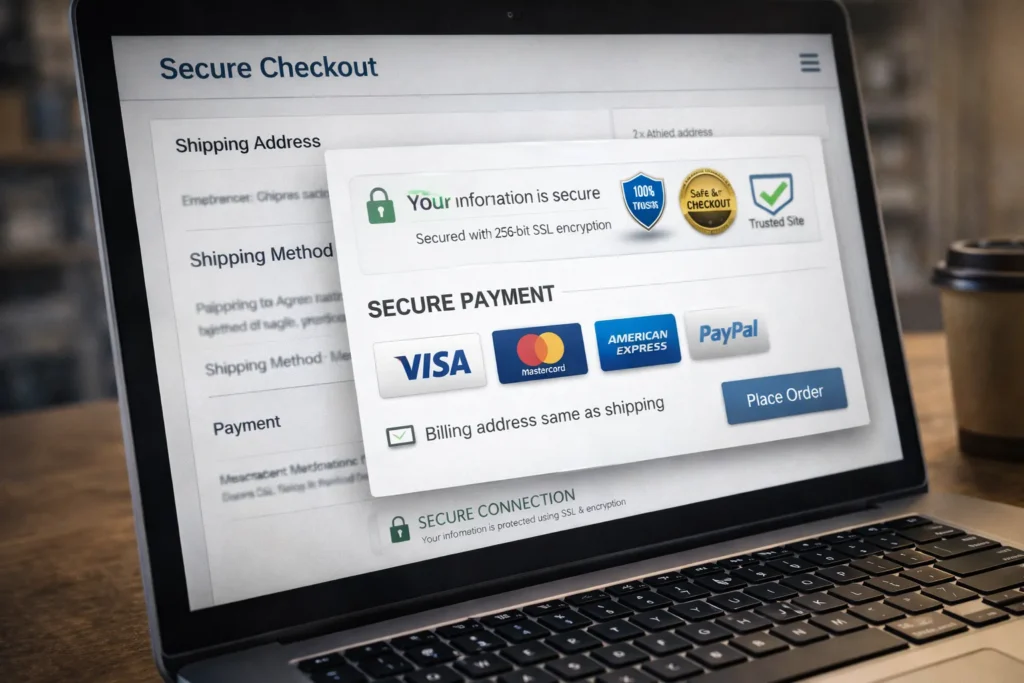
Problem
Buyers hesitate if checkout feels unsafe.
Missing signals:
- SSL lock
- Payment logos
- Trust badges
- Secure checkout text
Fear = abandonment.
Fix
Add visible trust signals:
- SSL badges
- Payment provider logos
- Secure checkout icons
- Guarantee badges
- Refund promise
- Money-back icons
Trust badges reduce risk perception.
Limited Payment Options
Problem
User reaches checkout — preferred payment not available.
They leave.
Fix
Add multiple payment options:
- Cards
- Wallets
- BNPL
- Local methods
- COD (where suitable)
More payment flexibility = fewer reasons for cart abandonment.
Poor Mobile Checkout UX
Problem
Mobile checkout is often broken:
- Tiny fields
- Hard typing
- Bad layout
- Long forms
Mobile users abandon faster.
Fix
Mobile cart optimization:
- Large fields
- Auto keyboards
- Fewer steps
- Tap-friendly buttons
- Mobile wallets
Mobile UX is now critical for Conversion Rate Optimization.
Weak CTA Buttons
Problem
Checkout buttons unclear:
- Bad color
- Weak wording
- Hard to see
- Not sticky
Users miss the next step.
Fix
Better CTAs:
- High contrast
- Large buttons
- Clear text:
- “Complete Order”
- “Secure Checkout”
- “Place My Order”
CTA clarity reduces hesitation.
No Return or Refund Clarity
Problem
Users fear:
- No returns
- No refunds
- No support
They abandon before payment.
Fix
Show policies near checkout:
- Easy returns
- Refund policy
- Support contact
- Delivery guarantee
Trust removes fear.
Delivery Time Not Clear
Problem
Users don’t know when the product arrives.
Uncertainty stops the purchase.
Fix
Show:
- Estimated delivery
- Shipping time
- Dispatch Speed Optimization
- Tracking info
Clarity increases confidence.
Coupon Code Box Distraction
Problem
Coupon field triggers users to leave and search for codes.
They often never return.
Fix
Options:
- Hide field behind link
- Auto-apply discounts
- Show savings directly
Reduce distraction during checkout.
No Social Proof at Checkout
Problem
No proof = low confidence.
Fix
Add near checkout:
- Star ratings
- Review counts
- Testimonial snippet
- Purchase counters
Social proof supports the decision.
Checkout Design Looks Unprofessional
Problem
Messy checkout design creates doubt.
Even good products fail with poor design.
Fix
Professional checkout design:
- Clean layout
- White space
- Simple flow
- Modern UI
- Consistent branding
This is where Ecommerce Development Services make a big difference.
How Cart Optimization Increases Sales Fast
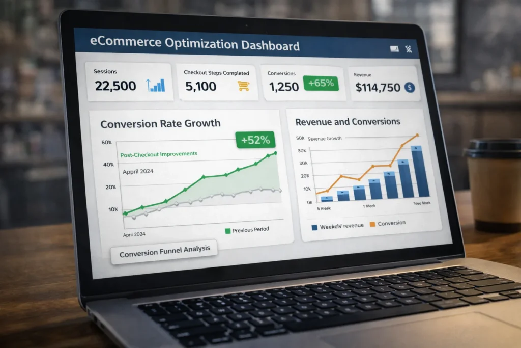
Cart optimization is not guesswork.
It’s a structured improvement.
Key optimization areas:
Checkout UX
- Fewer steps
- Clear flow
- Fast pages
Trust
- Trust badges
- Guarantees
- Clear policies
Design
- Clean layout
- Strong CTAs
- No clutter
Friction Removal
- Guest checkout
- Fewer fields
- Auto fill
Cart Recovery Tactics That Work
Even with fixes, some users leave.
Recover them.
Abandoned Cart Emails
Send:
- Reminder email
- Product image
- Checkout link
- Small incentive
Exit Intent Offers
Show:
- Small discount
- Free shipping
- Bonus gift
Retargeting Ads
Remind users of:
How Ecommerce Development Services Help Reduce Cart Abandonment

Professional Ecommerce Development Services help with:
- Checkout UX design
- Cart optimization
- Mobile checkout fixes
- Speed optimization
- Trust badge integration
- Payment gateway setup
- Conversion tracking
- A/B testing
Many cart abandonment reasons are technical — not just Digital Marketing.
Fixing code + UX = higher conversions.
Cart Abandonment Reasons vs Fix Summary
Biggest Problems
- Hidden costs
- Bad checkout UX
- Slow checkout
- No trust badges
- Forced account
- Weak CTAs
- Poor mobile design
Best Fixes
- Transparent pricing
- Guest checkout
- One-page checkout
- Trust signals
- Fast pages
- Strong CTA buttons
- Cart optimization
Final Thoughts
Traffic is expensive.
Getting users to the cart is hard.
Losing them at checkout is painful.
Most cart abandonment reasons are fixable with:
- Better checkout UX
- Strong trust badges
- Clear CTAs
- Faster checkout
- Smart cart optimization
- Professional Ecommerce Development Services
Fix the checkout — and your sales will grow without more ads.
Faqs
Hidden costs, poor checkout UX, slow pages, forced account creation, and missing trust badges are the most common cart abandonment reasons in ecommerce.
Yes. Clean checkout UX with fewer steps and fields can significantly increase completed orders and reduce cart abandonment rates.
Yes. Trust badges and security signals increase buyer confidence and reduce fear during payment, improving conversion rates.
In most cases, yes. Guest checkout removes friction and is proven to reduce cart abandonment reasons related to forced registration.
One-page or 2–3 step checkout flows usually perform best and reduce user fatigue during purchase.
Absolutely. Even small delays increase drop-offs. Speed optimization is critical for cart completion.
They improve checkout UX, cart optimization, speed, trust signals, and payment integration — directly reducing cart abandonment reasons.