

User experience (UX) design has evolved from a nice-to-have feature to an absolute necessity for website success. With 94% of first impressions being design-related and every $1 invested in UX yielding an average return of $100 (a staggering 9,900% ROI), businesses can no longer afford to ignore the science and art of creating exceptional user experiences.
This comprehensive guide will walk you through everything you need to know about UX design for websites—from foundational principles to advanced implementation strategies that drive measurable business results.
What is UX Design for Websites? {#what-is-ux-design}
User experience design is the strategic process of creating websites that are seamless, intuitive, engaging, and valuable for users. It goes far beyond visual aesthetics—encompassing the entire journey a visitor takes on your website, from their first interaction to achieving their goals.
UX vs UI: Understanding the Difference
While often used interchangeably, UX and UI design serve distinct purposes:
- UX (User Experience) Design focuses on the overall feel, functionality, and user journey. It’s about solving problems and creating intuitive navigation paths.
- UI (User Interface) Design concentrates on visual elements—colors, typography, buttons, and layout aesthetics.
Think of it this way: UX is the blueprint and foundation of a house, while UI is the interior decoration. Both are essential, but UX comes first.
The Business Case for UX Design {#business-case}
Investing in UX design isn’t just about creating pretty websites—it’s about driving tangible business results. Here’s what the data reveals:
Conversion Impact:
- A well-designed user interface can increase conversion rates by 200%
- Superior UX design can boost conversions by up to 400%
- E-commerce sites can improve checkout conversion rates by 35.26% through UX redesign
Financial Returns:
- Every $1 invested in UX design returns an average of $100 (9,900% ROI)
- Companies prioritizing UX experience 1.5x faster revenue growth
- Businesses can reduce Website Development costs by 20% through experience-driven transformation
User Behavior:
- 88% of online consumers are less likely to return after a bad experience
- 47% of users expect a webpage to load in 2 seconds or less
- 85% of adults believe mobile websites should be better than desktop versions
These numbers underscore a critical truth: good UX design directly impacts your bottom line.
Core UX Design Principles {#core-principles}
Understanding fundamental UX principles helps create intuitive, user-friendly websites that feel natural to navigate.
Don Norman’s Seven Fundamental Design Principles
1. Discoverability Users should easily find what they need without excessive searching or guessing. Clear navigation, logical information architecture, and visible CTAs make elements discoverable.
2. Affordances: Design elements should suggest their functionality through their appearance. Buttons should look clickable, links should be underlined or colored differently, and sliders should visually indicate they can be dragged.
3. Signifiers: These are cues that communicate how to use an interface. Examples include hover effects, cursor changes, button shadows, and instructional text.
4. Mapping: The relationship between controls and their effects should be logical. Up arrows should scroll up, right arrows should navigate forward, and controls should be positioned near what they affect.
5. Feedbac:k Every user action should receive immediate acknowledgment. Loading spinners, success messages, error notifications, and visual state changes provide essential feedback.
6. Conceptual Models Users develop mental models of how websites work based on past experiences. Your design should align with these expectations to reduce cognitive load.
7. Constraints Limitations prevent user errors by restricting actions to valid options. Examples include disabling submit buttons until forms are complete or preventing invalid date selections.
Psychology-Based UX Principles
Cognitive Load Theory: Minimize the mental effort required to complete tasks. Break complex processes into smaller steps, use progressive disclosure, eliminate unnecessary elements, and maintain visual simplicity.
Hick’s Law: The time required to make a decision increases with the number of choices. Limit menu options, use categorization, implement progressive disclosure, and guide users toward recommended actions.
Fitts’ Law: The time to acquire a target depends on its size and distance. Make important buttons larger, position frequently-used items within easy reach, increase spacing between clickable elements, and optimize for touch targets on mobile (minimum 44×44 pixels).
Miller’s Law: People can hold about 7±2 items in working memory. Chunk information into groups, use numbering for sequential steps, limit navigation menu items, and break long forms into sections.
Gestalt Principles Users perceive and organize visual elements into groups:
- Proximity: Related items should be close together
- Similarity: Similar elements are perceived as related
- Continuity: Eyes follow paths naturally
- Closure: Brains fill in missing information
- Figure-Ground: Users distinguish objects from backgrounds
Jakob’s Law: Users spend most of their time on other websites, so they prefer your site to work similarly. Follow established design patterns for common elements like navigation, forms, and checkout processes.
The Complete UX Design Process {#ux-process}
Professional UX design follows a structured methodology that ensures user needs drive design decisions.
Phase 1: Research & Discovery
User Research Methods:
- User Interviews: One-on-one conversations to understand motivations, pain points, and goals
- Surveys & Questionnaires: Quantitative data collection from larger audiences
- Analytics Review: Examining existing website data for user behavior patterns
- Competitive Analysis: Evaluating competitor websites for strengths and weaknesses
- Heuristic Evaluation: Expert review against established usability principles
Key Questions to Answer:
- Who are our users?
- What problems are they trying to solve?
- What frustrates them about current solutions?
- What are their goals and motivations?
- What devices and contexts do they use?
Phase 2: Define & Synthesize
Creating User Personas: User personas are fictional representations of your target users based on research data. A complete persona includes:
- Demographics (age, location, occupation)
- Goals and motivations
- Pain points and frustrations
- Behaviors and preferences
- Technology comfort level
- Relevant quotes from research
User Journey Mapping: Journey maps visualize the complete user experience across touchpoints:
- Stages: Awareness, Consideration, Decision, Use, Advocacy
- User Actions: What users do at each stage
- Touchpoints: Where interactions occur
- Emotions: How users feel throughout
- Pain Points: Friction and obstacles encountered
- Opportunities: Areas for improvement
Problem Statements: Clearly articulate the problems your design will solve: “[Persona name] needs a way to [user need] because [insight].”
Phase 3: Ideation & Design
Information Architecture: Organize and structure website content logically:
- Site Mapping: Visual hierarchy of all pages and their relationships
- Card Sorting: Users organize topics into categories that make sense to them
- Navigation Design: Primary, secondary, and utility navigation systems
- Content Strategy: Determine what content is needed and where
Wireframing: Low-fidelity sketches focusing on layout and functionality without visual design:
- Establish page layouts and element placement
- Define content hierarchy
- Plan user flows between pages
- Identify interactive elements
- Test concepts quickly and cheaply
Prototyping: High-fidelity interactive mockups simulating the final product:
- Create realistic, clickable experiences
- Test interactions and animations
- Validate design decisions with stakeholders
- Prepare detailed specifications for developers
- Conduct usability testing before Shopify Development
Phase 4: Testing & Validation
Usability Testing Methods:
Moderated Testing:
- Facilitator guides participants through tasks
- Ask follow-up questions for deeper insights
- Observe body language and reactions
- Clarify confusing feedback immediately
Unmoderated Testing:
- Participants complete tasks independently
- Scalable to larger sample sizes
- More cost-effective
- Captures natural behavior without influence
A/B Testing: Compare two versions to determine which performs better:
- Test one variable at a time
- Ensure statistical significance
- Measure against specific goals
- Implement winning variations
Key Metrics to Track:
- Task success rate
- Time to complete tasks
- Error rate and recovery
- User satisfaction scores
- Navigation paths taken
Phase 5: Implementation & Iteration
Developer Handoff:
- Detailed design specifications
- Interactive prototypes
- Design system documentation
- Asset files and resources
- Accessibility requirements
Continuous Improvement: UX design is never “finished.” Continuously:
- Monitor analytics and user feedback
- Conduct regular usability audits
- Test new features before launch
- Iterate based on data insights
- Stay current with UX best practices
Essential UX Elements for Websites {#essential-elements}
Navigation Design
Navigation is the roadmap users follow to find information and complete tasks.
Types of Navigation:
- Primary Navigation: Main menu accessing major site sections
- Secondary Navigation: Subcategories and related pages
- Utility Navigation: Account, cart, search, contact
- Footer Navigation: Sitemap, legal, resources
- Breadcrumbs: Show current location within hierarchy
Navigation Best Practices:
- Limit primary menu items to 7 or fewer
- Use clear, descriptive labels (not clever or vague)
- Maintain consistency across all pages
- Make the current location obvious
- Implement sticky navigation for long pages
- Optimize for mobile with hamburger or tab bar patterns
Website Speed & Performance
Speed is a critical UX factor that directly impacts conversions and user satisfaction.
Core Web Vitals: Google’s performance metrics measuring real user experience:
Largest Contentful Paint (LCP):
- Measures loading performance
- Target: Under 2.5 seconds
- Optimize: Compress images, leverage CDNs, minimize server response time
First Input Delay (FID):
- Measures interactivity
- Target: Under 100 milliseconds
- Optimize: Reduce JavaScript execution time, implement code splitting
Cumulative Layout Shift (CLS):
- Measures visual stability
- Target: Less than 0.1
- Optimize: Reserve space for images, avoid inserting content above existing elements
Speed Impact:
- 47% of users expect pages to load in 2 seconds or less
- A 1-second delay reduces conversions by 7%
- 53% of mobile users abandon sites taking over 3 seconds to load
Mobile Responsiveness
With mobile traffic exceeding desktop, mobile-first design is non-negotiable.
Mobile UX Principles:
- Touch targets minimum 44×44 pixels
- Thumb-friendly navigation zones
- Simplified navigation (hamburger or bottom tab bar)
- Readable text without zooming (16px minimum)
- Forms optimized for mobile keyboards
- Minimal scrolling and input required
- Fast loading on slower connections
Responsive Design Approaches:
- Fluid Grids: Layouts scale proportionally
- Flexible Images: Images resize within containers
- Media Queries: CSS rules for different screen sizes
- Mobile-First: Design for small screens, then enhance for larger
Content Readability
Content must be scannable and easy to digest.
Typography Best Practices:
- Font size: 16-18px for body text
- Line height: 1.5-1.6 for optimal readability
- Line length: 50-75 characters per line
- Font choice: Web-safe, legible fonts
- Hierarchy: Clear distinction between headings and body
Content Structure:
- Short paragraphs (2-3 sentences)
- Descriptive subheadings every 300 words
- Bullet points for lists
- Bold or italic for emphasis (sparingly)
- White space to prevent overwhelm
- Visual breaks with images or graphics
Scanning Patterns:
- F-Pattern: Users scan horizontally across the top, then down the left side
- Z-Pattern: Eyes move across top, diagonally down, across bottom
- Design layouts that accommodate natural scanning behavior
Visual Hierarchy
Guide users’ attention to the most important elements first.
Visual Weight Techniques:
- Size: Larger elements attract more attention
- Color: Bright or contrasting colors stand out
- Contrast: High contrast draws focus
- Position: Upper-left gets attention first (Western cultures)
- White Space: Isolation emphasizes importance
- Typography: Bold, italic, or different fonts create emphasis
Example Hierarchy:
- Primary headline (largest, boldest)
- Subheadings (medium size, distinct style)
- Body text (readable, comfortable size)
- Metadata (smallest, less prominent)
Forms & User Input
Forms are often friction points where users abandon websites.
Form Design Best Practices:
- Minimize required fields (ask only what’s necessary)
- Use clear, descriptive labels above fields
- Provide inline validation with helpful error messages
- Group related fields logically
- Show password strength indicators
- Implement autofill support
- Mobile: Use appropriate keyboard types (numeric, email, etc.)
- Include privacy assurance near sensitive fields
Error Handling:
- Validate in real-time when possible
- Clearly indicate which fields have errors
- Provide specific, actionable error messages
- Never clear correctly-filled fields after submission errors
- Use color AND icons (not color alone for accessibility)
Calls-to-Action (CTAs)
CTAs drive conversions and guide users toward desired actions.
Effective CTA Principles:
- Use action-oriented language (“Get Started,” “Download Now,” “Join Free”)
- Create visual prominence with contrasting colors
- Make buttons large enough to click easily
- Position strategically (above fold, at decision points)
- One primary CTA per page/section
- Communicate value proposition (“Start Your Free Trial”)
Button Design:
- Sufficient padding (minimum 44x44px for mobile)
- Rounded corners often feel more clickable
- Shadows or gradients suggest depth
- Hover states provide interaction feedback
- Loading states during processing
- Disabled states for unavailable actions
User Research Methods {#user-research}
Understanding your users through research is the foundation of effective UX design.
Qualitative Research Methods
User Interviews: One-on-one conversations providing deep insights into user motivations, behaviors, and pain points.
Best Practices:
- Prepare open-ended questions
- Ask “why” to dig deeper
- Let participants elaborate
- Record sessions (with permission)
- Interview 5-8 users per persona
- Look for patterns across interviews
Example Questions:
- “Walk me through how you currently accomplish [task].”
- “What’s most frustrating about [current solution]?”
- “What would make this process easier for you?”
- “Tell me about the last time you [relevant action].”
Focus Groups: Moderated discussions with 6-10 participants exploring attitudes and perceptions.
Contextual Inquiry: Observing users in their natural environment as they perform tasks.
Think-Aloud Protocols: Users verbalize their thought process while completing tasks, revealing mental models and confusion points.
Quantitative Research Methods
Surveys & Questionnaires: Structured data collection from large audiences for statistical analysis.
Survey Best Practices:
- Keep surveys short (under 10 minutes)
- Use multiple question types (multiple choice, scales, open-ended)
- Avoid leading or biased questions
- Test survey before wide distribution
- Offer incentives for completion
Analytics Analysis: Examine existing data to identify patterns:
- Top landing and exit pages
- User flow through the website
- Conversion funnel drop-off points
- Device and browser usage
- Geographic and demographic data
- Search queries and on-site behavior
Heat Mapping: Visual representations of where users click, scroll, and focus attention:
- Click Maps: Where users click most
- Scroll Maps: How far users scroll
- Movement Maps: Cursor movement patterns
Session Recordings: Video replays of individual user sessions revealing real behavior and friction points.
Creating Actionable User Personas
Effective personas synthesize research into representative user archetypes.
Persona Components:
- Name and photo (makes them memorable)
- Demographics (age, location, occupation, income)
- Goals and motivations
- Pain points and frustrations
- Behaviors and preferences
- Technology proficiency
- Relevant quote
- Website usage context
Example Persona Structure:
Sarah Mitchell – The Busy Professional
- Age: 34, Marketing Manager, Urban setting
- Goals: Quick access to information, efficient task completion
- Frustrations: Slow websites, complicated navigation, excessive form fields
- Behaviors: Mobile-first user, researches thoroughly before purchasing
- Quote: “I need to find what I’m looking for in under a minute, or I’m moving on.”
Use personas throughout the design process to evaluate decisions: “Would Sarah understand this navigation?” “Does this form respect Sarah’s time?”
User Journey Mapping
Journey maps visualize the complete user experience from initial awareness through advocacy.
The Journey Map Components:
- Persona: Which user type is this journey for?
- Scenario: What goal is the user trying to accomplish?
- Stages: Phases of the journey (Awareness, Research, Decision, Use, Support)
- Actions: Specific tasks users perform
- Touchpoints: Where interactions occur (website, email, phone, etc.)
- Thoughts: What users think at each stage
- Emotions: How users feel (visualized as an emotional curve)
- Pain Points: Obstacles and frustrations
- Opportunities: Areas for improvement
Journey maps reveal where users experience friction and where strategic improvements will have the greatest impact.
UX Design Tools and Technologies {#ux-tools}

Modern UX design relies on specialized tools for each phase of the process.
Design & Prototyping Tools
Figma (Most Popular)
- Cloud-based collaboration
- Real-time multiplayer editing
- Complete design system support
- Interactive prototyping capabilities
- Extensive plugin ecosystem
- Free tier available
Adobe XD
- Integrated with Adobe Creative Cloud
- Voice prototyping features
- Repeat grid for quick layouts
- Auto-animate transitions
- Coediting capabilities
Sketch
- Mac-only vector design tool
- Extensive plugin library
- Symbols for reusable components
- Strong developer handoff features
- Industry standard for years
Axure RP
- Advanced prototyping with conditional logic
- Dynamic content and variables
- Documentation generation
- Complex interaction design
- Learning curve steeper than alternatives
User Research & Testing Tools
UserTesting.com
- On-demand user testing
- Video recordings with audio
- Access to a diverse participant pool
- Quick turnaround (hours)
- Paid platform
Hotjar
- Heat maps and click tracking
- Session recordings
- Conversion funnels
- User feedback polls
- Affordable pricing tiers
Maze
- Rapid testing on prototypes
- Quantitative usability metrics
- Path analysis
- Integrates with Figma, Adobe XD
- Free tier available
Optimal Workshop
- Card sorting (finding optimal information architecture)
- Tree testing (validating navigation)
- First-click testing
- Specialized research tools
Lookback
- Live user interviews
- Remote unmoderated studies
- Participant recruitment
- Collaborative analysis
Analytics & Measurement Tools
Google Analytics 4
- Free comprehensive analytics
- User behavior tracking
- Conversion funnel analysis
- Audience segmentation
- Custom event tracking
Hotjar (Analytics Features)
- Behavior analytics
- Form analytics
- Feedback polls
- Survey tools
Crazy Egg
- Heat maps
- Scroll maps
- A/B testing
- Session recordings
Mixpanel
- Product analytics
- User journey analysis
- Cohort analysis
- Retention tracking
Collaboration Tools
Miro
- Virtual whiteboarding
- Workshop facilitation
- Journey mapping templates
- Brainstorming sessions
- Remote collaboration
FigJam
- Figma’s whiteboarding tool
- Design thinking exercises
- Sticky notes and diagramming
- Real-time collaboration
Notion
- Documentation
- Research repository
- Project management
- Team wiki
Website Accessibility Standards {#accessibility}
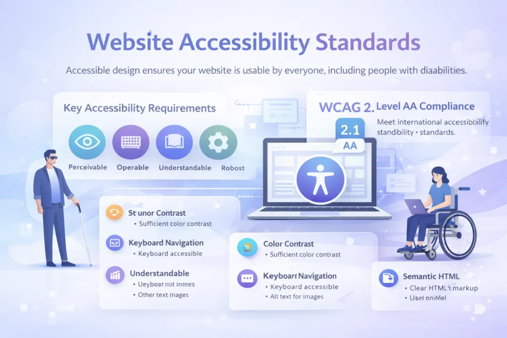
Accessible design ensures your website is usable by everyone, including people with disabilities. Beyond being the right thing to do, accessibility is increasingly a legal requirement.
WCAG Guidelines
The Web Content Accessibility Guidelines (WCAG) provide international standards for web accessibility. WCAG 2.1 Level AA is the most commonly required compliance level.
The Four POUR Principles:
1. Perceivable Information must be presentable to users in ways they can perceive.
- Text Alternatives: Provide alt text for images
- Captions & Transcripts: For audio and video content
- Adaptable Content: Can be presented in different ways without losing information
- Distinguishable: Easy to see and hear, with sufficient contrast
2. Operable User interface components must be operable.
- Keyboard Accessible: All functionality available via keyboard
- Enough Time: Users have adequate time to read and use content
- No Seizures: Nothing flashes more than three times per second
- Navigable: Clear navigation, descriptive page titles, visible focus indicators
- Input Modalities: Multiple ways to interact (not just mouse)
3. Understandable Information and operation must be understandable.
- Readable: Clear language appropriate for the audience
- Predictable: Pages behave consistently
- Input Assistance: Help users avoid and correct mistakes
- Error Identification: Clear error messages with suggestions
4. Robust Content must be robust enough for assistive technologies.
- Compatible: Works with current and future assistive technologies
- Valid HTML: Properly structured code
- Name, Role, Value: Custom components programmatically determinable
Key Accessibility Requirements
Color Contrast:
- Normal text: 4.5:1 minimum ratio
- Large text (18pt+ or 14pt+ bold): 3:1 minimum
- UI components and graphics: 3:1 minimum
- Test with tools like WebAIM Contrast Checker
Keyboard Navigation:
- All interactive elements are accessible via the Tab key
- Visible focus indicators showing current position
- Logical tab order following visual flow
- Skip navigation links for keyboard users
- No keyboard traps
Alternative Text:
- Descriptive alt text for meaningful images
- Empty alt=”” for decorative images
- Alt text conveys content and function
- Avoid “image of” or “picture of.”
Form Accessibility:
- Labels clearly associated with inputs
- Required fields indicated
- Error messages specific and helpful
- Instructions were provided before the fields
- Field purpose programmatically identifiable
Semantic HTML:
- Use proper heading hierarchy (H1, H2, H3)
- Semantic elements (nav, main, article, aside, footer)
- Lists for sequential or grouped content
- Tables for tabular data with proper headers
- Buttons for actions, links for navigation
Screen Reader Considerations:
- Meaningful link text (not “click here”)
- ARIA labels when visual labels are insufficient
- Landmark regions for page structure
- Status messages are announced appropriately
- Hidden content handled correctly
Accessibility Testing
Automated Testing Tools:
- WAVE (WebAIM)
- axe DevTools
- Lighthouse (built into Chrome)
- Pa11y
Manual Testing:
- Keyboard navigation testing
- Screen reader testing (NVDA, JAWS, VoiceOver)
- Color contrast verification
- Content readability assessment
- Logical content structure review
Assistive Technologies to Test With:
- Screen readers (NVDA free, JAWS, VoiceOver on Mac/iOS)
- Screen magnifiers
- Voice control software
- Keyboard-only navigation
Measuring UX Success {#measuring-success}
Effective UX design requires measurable goals and continuous monitoring.
Quantitative UX Metrics
Task Success Rate: Percentage of users who complete a task.
- Target: 80%+ for critical tasks
- Measure during usability testing and with analytics
Time on Task: How long it takes users to complete a task.
- Track over time to measure improvements
- Compare against benchmarks or competitors
- Balance speed with accuracy
Error Rate: Frequency of user mistakes.
- Track form errors
- Monitor failed searches
- Identify confusing navigation paths
- Target: Continuous reduction
System Usability Scale (SUS): 10-question standardized survey measuring perceived usability.
- Scores range 0-100
- A score above 68 is above average
- A score above 80 is excellent
- Benchmarkable across products
Conversion Rate: Percentage of visitors completing desired actions.
- Track macro conversions (purchases, signups)
- Track micro conversions (downloads, email signups)
- Monitor by traffic source, device, page
- A/B test to optimize continuously
Analytics Metrics:
- Bounce Rate: Single-page sessions (target: under 50%)
- Pages Per Session: Engagement depth (higher generally better)
- Session Duration: Time spent on site
- Exit Rate: Where users leave your site
- Click-Through Rate: Engagement with CTAs
Qualitative Feedback Methods
Net Promoter Score (NPS): Measures user loyalty with one question: “How likely are you to recommend [product] to a friend?”
- Scores 9-10: Promoters
- Scores 7-8: Passives
- Scores 0-6: Detractors
- NPS = % Promoters – % Detractors
- Benchmark varies by industry
Customer Satisfaction (CSAT): Measures satisfaction with specific interactions or overall experience.
- Usually, a 5-point scale
- Asked after specific interactions
- Target: 80%+ satisfied/very satisfied
User Feedback Collection:
- On-page feedback widgets
- Exit surveys
- Email surveys post-interaction
- Social media monitoring
- Support ticket analysis
- User testing sessions
Sentiment Analysis: Analyze qualitative feedback to identify themes:
- Common pain points
- Feature requests
- Usability issues
- Positive experiences
- Competitive comparisons
Core Web Vitals Monitoring
Google’s performance metrics directly impact SEO Optimization and user experience:
Tools for Monitoring:
- Google Search Console
- PageSpeed Insights
- Chrome User Experience Report
- Lighthouse CI
- WebPageTest
Setting Up Monitoring:
- Establish baseline measurements
- Set performance budgets
- Monitor continuously (not just at launch)
- Alert when metrics degrade
- Test on real devices and connections
UX and SEO Integration {#ux-seo}
UX and SEO are deeply interconnected—Google increasingly prioritizes user experience signals in search rankings.
How UX Affects SEO
Page Experience Signals: Google explicitly considers these UX factors:
- Core Web Vitals performance
- Mobile-friendliness
- HTTPS security
- Intrusive interstitial guidelines (no annoying popups)
Behavioral Signals: User behavior indicates content quality:
- Dwell Time: Longer visits suggest valuable content
- Bounce Rate: High bounces indicate a poor match or a bad UX
- Pogo-Sticking: Returning to search results suggests dissatisfaction
- Click-Through Rate: Compelling titles and meta descriptions
Site Structure: Clear information architecture benefits both users and crawlers:
- Logical hierarchy
- Descriptive URLs
- Internal linking structure
- Breadcrumb navigation
- XML sitemaps
UX Improvements That Boost SEO
Mobile Optimization: Google uses mobile-first indexing—mobile UX directly impacts rankings.
- Responsive design
- Fast mobile loading
- Touch-friendly navigation
- No mobile pop-up penalties
Site Speed: Page speed is a confirmed ranking factor and a critical UX element.
- Optimize images
- Leverage browser caching
- Minimize JavaScript
- Use CDNs
- Implement lazy loading
Engagement Optimization: Keep users on your site longer:
- Compelling, scannable content
- Internal linking to related content
- Clear calls-to-action
- Multimedia content
- Regular content updates
Accessibility: Accessible sites are more crawlable and provide better UX:
- Semantic HTML structure
- Descriptive link text
- Proper heading hierarchy
- Alt text for images
- Readable content
Content Structure: Organize content for both humans and search engines:
- Clear H1-H6 hierarchy
- Featured snippets optimization
- FAQ sections with schema markup
- Table of contents for long content
- Bullet points and lists
Common UX Mistakes to Avoid
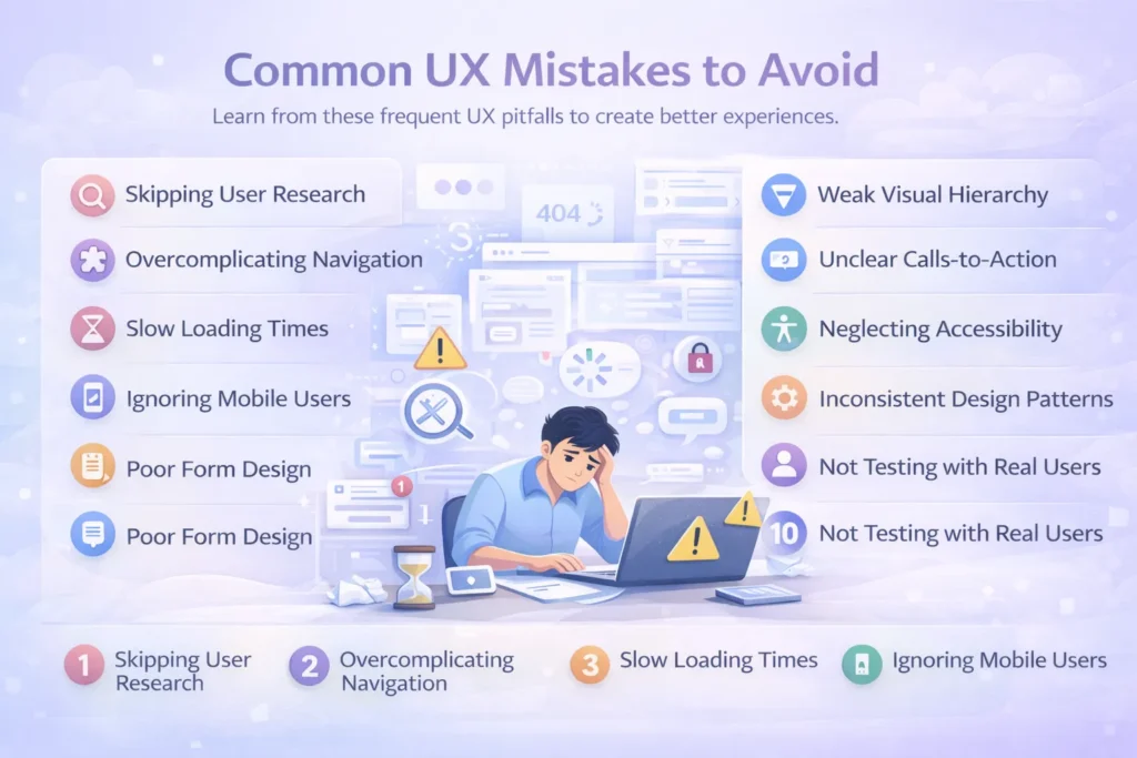
Learn from these frequent UX pitfalls to create better experiences.
1. Skipping User Research
The Mistake: Designing based on assumptions, personal preferences, or stakeholder opinions instead of actual user needs.
The Solution:
- Conduct research with real users before designing
- Validate assumptions with data
- Create evidence-based personas
- Test designs with target users
- Remember: You are not your user
2. Overcomplicating Navigation
The Mistake: Too many menu items, unclear labels, hidden navigation, or inconsistent navigation patterns.
The Solution:
- Limit primary navigation to 7 items or fewer
- Use clear, descriptive labels
- Maintain consistency across all pages
- Implement breadcrumbs for deep sites
- Test navigation with card sorting
3. Slow Loading Times
The Mistake: Large, unoptimized images, excessive scripts, render-blocking resources, poor hosting.
The Solution:
- Optimize and compress all images
- Implement lazy loading
- Minimize and defer JavaScript
- Use CDN for static assets
- Monitor Core Web Vitals continuously
4. Ignoring Mobile Users
The Mistake: Desktop-first design that doesn’t adapt well to mobile, tiny touch targets, and unreadable text.
The Solution:
- Adopt a mobile-first design approach
- Test on real mobile devices
- Ensure touch targets are 44x44px minimum
- Optimize forms for mobile keyboards
- Consider thumb-friendly zones
5. Poor Form Design
The Mistake: Too many required fields, vague labels, unhelpful error messages, and clearing data on error.
The Solution:
- Ask only for the necessary information
- Provide clear labels above fields
- Validate in real-time with specific error messages
- Preserve correctly-filled fields after errors
- Show progress on multi-step forms
6. Weak Visual Hierarchy
The Mistake: Everything looks equally important, no clear entry points, poor contrast, lack of white space.
The Solution:
- Size elements according to importance
- Use color to create emphasis
- Leverage white space strategically
- Create clear visual paths
- Guide attention with contrast
7. Unclear Calls-to-Action
The Mistake: Vague CTA language, insufficient visual prominence, too many competing CTAs, poor placement.
The Solution:
- Use action-oriented language
- Make primary CTAs visually prominent
- One primary CTA per section
- Position strategically throughout the page
- A/B test CTA variations
8. Neglecting Accessibility
The Mistake: Poor color contrast, no keyboard navigation, missing alt text, and unclear focus indicators.
The Solution:
- Follow WCAG 2.1 AA guidelines
- Test with keyboard navigation
- Ensure sufficient color contrast
- Provide alt text for images
- Use semantic HTML
- Test with screen readers
9. Inconsistent Design Patterns
The Mistake: Different button styles, varying interaction patterns, inconsistent spacing, and colors.
The Solution:
- Create and maintain a design system
- Document component specifications
- Use consistent spacing scales
- Standardize interactive elements
- Regular design reviews for consistency
10. Not Testing with Real Users
The Mistake: Assuming designs work without validation, launching without testing, and relying only on stakeholder feedback.
The Solution:
- Conduct usability testing at multiple stages
- Test with representative users
- Observe real behavior, not just opinions
- Test on actual devices and browsers
- Iterate based on findings
UX Design Trends for 2026 {#ux-trends}
Stay current with emerging trends shaping the future of UX design.
AI-Driven Personalization
Artificial intelligence enables dynamic, personalized experiences:
- Content recommendations based on behavior
- Adaptive interfaces adjusting to user preferences
- Predictive search and suggestions
- Chatbots for instant support
- Personalized learning paths
Voice User Interfaces (VUI)
Voice interaction continues growing:
- Voice search optimization
- Voice commands for navigation
- Audio content accessibility
- Conversational interfaces
- Multi-modal experiences (voice + visual)
Immersive Technologies
AR and 3D elements create engaging experiences:
- 3D product visualization
- Virtual try-on features
- Interactive 3D models
- Spatial design considerations
- WebGL and WebXR implementations
Dark Mode Standard
User-controlled appearance preferences:
- System-level dark mode support
- Toggle options for user control
- Optimized contrast for both modes
- Battery-saving benefits of OLED
- Reduced eye strain in low-light conditions
Micro-Interactions & Animations
Subtle animations enhance perceived performance and delight:
- Loading state animations
- Hover effects providing feedback
- Scroll-triggered animations
- Pull-to-refresh interactions
- Celebration moments for achievements
Minimalism & Brutalism
Design aesthetics continue evolving:
- Minimalism: Clean, focused, plenty of white space
- Brutalism: Raw, bold, intentionally unconventional
- Focus on content over decoration
- Fast loading times
- Clear information hierarchy
Inclusive & Accessible Design
Accessibility moves from compliance to competitive advantage:
- Inclusive design from the start
- Broader definition of accessibility
- Neurodiversity considerations
- Multi-sensory experiences
- Universal design principles
Sustainability in Design
Environmental consciousness in digital design:
- Optimized performance, reducing energy consumption
- Sustainable hosting choices
- Minimal data transfer
- Efficient code practices
- Carbon-aware design decisions
Advanced Search Experiences
Search becomes more intelligent and contextual:
- Natural language processing
- Visual search capabilities
- Filters and faceted search
- Search intent understanding
- Zero-results optimization
Progressive Disclosure
Reveal complexity gradually:
- Show basic options by default
- Advanced features available but hidden
- Step-by-step processes
- Contextual help when needed
- Reduced cognitive overload
Implementing UX Design: Getting Started
Ready to improve your website’s user experience? Follow this action plan:
Immediate Actions (This Week)
- Audit Current UX: Conduct a heuristic evaluation of your existing website
- Review Analytics: Identify your highest traffic pages and biggest drop-off points
- Speed Test: Check your Core Web Vitals and page speed scores
- Mobile Test: Browse your site on multiple mobile devices
- Accessibility Scan: Run automated accessibility testing
Short-Term Goals (This Month)
- User Research: Interview 5-8 current or potential users
- Create Personas: Develop 2-3 user personas based on research
- Journey Mapping: Map critical user journeys, identifying pain points
- Quick Wins: Fix obvious usability issues discovered in the audit
- Set Benchmarks: Establish baseline metrics for key UX indicators
Long-Term Strategy (This Quarter)
- UX Process: Implement structured UX methodology
- Design System: Begin building a consistent component library
- Usability Testing: Conduct regular testing sessions
- Continuous Improvement: Establish ongoing optimization cycles
- Team Training: Educate stakeholders on UX principles
When to Hire UX Professionals
Consider professional UX help when:
- Your website serves thousands of users
- Conversions are below industry benchmarks
- Redesigning or launching major features
- Internal team lacks UX expertise
- Significant business investment in digital products
- Compliance with accessibility standards is required
- Competitive differentiation through experience
Conclusion
UX design for websites is no longer optional—it’s a fundamental business necessity. With conversion rate improvements of up to 400%, an ROI of 9,900%, and direct impacts on SEO rankings, investing in user experience delivers measurable returns.
The most successful websites share common characteristics: they’re fast, accessible, mobile-friendly, easy to navigate, and designed around actual user needs rather than assumptions. They follow established UX principles while innovating where it creates genuine value.
Key Takeaways:
- Start with research: Understand your users before designing
- Follow established principles: Leverage psychology and proven patterns
- Design systematically: Use a structured UX process
- Test continuously: Validate decisions with real users
- Measure rigorously: Track metrics and iterate based on data
- Prioritize accessibility: Design inclusively from the start
- Optimize performance: Speed is a feature, not an afterthought
- Think mobile-first: Mobile users are the majority
- Integrate with SEO: UX and SEO amplify each other
- Never stop improving: UX is continuous, not a one-time project
Whether you’re building a new website or improving an existing one, applying these UX design principles will create experiences that users love, search engines reward, and businesses benefit from.
Faqs
UX design is the process of creating websites that are intuitive, efficient, and enjoyable to use, focusing on the entire user journey from first visit to goal completion.
UX design focuses on overall functionality, user flow, and problem-solving, while UI design concentrates on visual elements like colors, typography, and layout aesthetics.
Every $1 invested in UX design returns an average of $100, representing a 9,900% ROI. Good UX can increase conversion rates by up to 400%.
Timelines vary by project scope, but typically: research (2-3 weeks), design (3-6 weeks), testing (2-3 weeks), with iteration throughout.
Popular tools include Figma, Adobe XD, and Sketch for design; UserTesting, Hotjar, and Maze for research; and Google Analytics for measurement.
Track quantitative metrics (task success rate, time on task, conversion rate, Core Web Vitals) and qualitative feedback (NPS, CSAT, user interviews, usability testing).
Google’s performance metrics measure loading (LCP), interactivity (FID), and visual stability (CLS). They directly impact both user experience and SEO rankings.